Красивое оформление содержания статьи на сайте
Содержание статьи представляет собой список ссылок, ведущих на разделы вашей страницы. Его использование улучшает читабельность, доступность и SEO, помогая пользователю лучше понять структуру статьи.
Вы можете придерживаться стандартного отображения списков, а можете добавить собственные стили, тем самым выделив блок содержания на странице.
Все примеры адаптированы для мобильных устройств.
Перейти на страницу с примерами
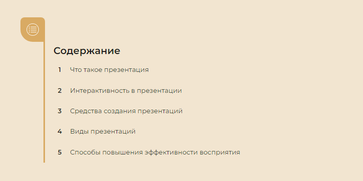
Пример 1.
<div class="container">
   <section class="toc-wrapper">
      <h1>Содержание</h1>
      <ol class="toc">
         <li><a href="">Что такое презентация</a></li>
         <li><a href="">Интерактивность в презентации</a></li>
         <li><a href="">Средства создания презентаций</a></li>
         <li><a href="">Виды презентаций</a></li>
         <li><a href="">Способы повышения эффективности восприятия</a></li>
      </ol>
   </section>
</div>
@import url('https://fonts.googleapis.com/css2?family=Noto+Serif:wght@400;700&display=swap');
* {
margin: 0;
padding: 0;
box-sizing: border-box;
}
body {
font-family: 'Noto Serif', serif;
line-height: 1;
color: #231E20;
background: #F2D8CE;
}
a {
text-decoration: none;
color: #231E20;
}
.container {
padding: 0 20px;
}
h1 {
margin-bottom: 40px;
}
.toc-wrapper {
width: 100%;
max-width: 768px;
margin: 0 auto 40px;
padding-left: 40px;
}
.toc {
list-style: none;
counter-reset: li;
background: url(https://html5book.ru/wp-content/uploads/2022/01/isolate.jpg) no-repeat;
background-size: cover;
padding: 50px 0;
}
.toc li {
position: relative;
padding: 20px 20px 20px 0;
background: #F2D8CE;
margin-bottom: 50px;
line-height: 1.2;
transition: .3s linear;
}
.toc li:last-child {
margin-bottom: 0;
}
.toc li:before {
counter-increment: li;
content: counters(li, ".") ". ";
position: absolute;
width: 40px;
text-align: center;
font-weight: 700;
font-size: 1.2em;
left: -40px;
top: 0;
bottom: 0;
display: flex;
align-items: center;
transition: .3s linear;
}
.toc li:hover:before {
padding-left: 10px;
}
@media(max-width:767px) {
h1 {
margin-bottom: 30px;
}
.toc li {
padding: 15px 20px 15px 0;
margin-bottom: 40px;
}
}Пример 2.
<div class="container">
   <section class="toc-wrapper">
      <div class="logo-wrapper">
         <div class="logo"><span></span></div>
      </div>
      <div class="content-wrapper">
         <h1>Содержание</h1>
         <ol class="toc">
            <li><a href="">Что такое презентация</a></li>
            <li><a href="">Интерактивность в презентации</a></li>
            <li><a href="">Средства создания презентаций</a></li>
            <li><a href="">Виды презентаций</a></li>
            <li><a href="">Способы повышения эффективности восприятия</a></li>
         </ol>
      </div>
   </section>
</div>
@import url('https://fonts.googleapis.com/css2?family=Montserrat:wght@400;600&display=swap');
* {
margin: 0;
padding: 0;
box-sizing: border-box;
}
body {
font-family: 'Montserrat', sans-serif;
line-height: 1;
background: #1C1A30;
}
a {
text-decoration: none;
color: #1C1A30;
}
.container {
padding: 0 20px;
}
h1 {
margin-bottom: 40px;
color: #1C1A30;
text-transform: uppercase;
}
.toc-wrapper {
width: 100%;
max-width: 960px;
margin: 0 auto 40px;
}
.logo {
width: 200px;
height: 200px;
position: relative;
background:
linear-gradient(45deg, #F5AF69 50%, #F4EED7 50.9%),
linear-gradient(90deg, #FC5135 50%, #4E203C 50%),
linear-gradient(-45deg, #F5AF69 50%, #E8D9A0 50.9%),
linear-gradient(#FC5135 50%, #4E203C 50%),
linear-gradient(-45deg, #F5AF69 50%, #E8D9A0 50.9%),
linear-gradient(90deg, #FC5135 50%, #4E203C 50%),
linear-gradient(45deg, #FC5135 50%, #F5AF69 50.9%);
background-size: 50px 50px, 100px 50px, 50px 50px, 200px 100px, 50px 50px, 100px 50px, 50px 50px;
background-repeat: no-repeat;
background-position: 0 0, 50px 0px, 150px 0, 0 50px, 0 150px, 50px 150px, 150px 150px;
}
.logo:before {
content: "";
position: absolute;
top: 30px;
left: 30px;
width: 140px;
height: 140px;
transform: rotate(45deg);
background: linear-gradient(45deg, #F4EED7 50%, #E8D9A0 50%);
}
.logo:after {
content: "";
position: absolute;
top: 55px;
left: 55px;
width: 90px;
height: 90px;
transform: rotate(45deg);
background: linear-gradient(45deg, #FC5135 50%, #4E203C 49.9%),
linear-gradient(-45deg, #F5AF69 50%, transparent 50%),
linear-gradient(#FC5135 50%, #FC5135 50%),
linear-gradient(-45deg, #4E203C 50%, transparent 50%);
background-size: 45px 45px;
background-repeat: no-repeat;
background-position: 0 0, 0 45px, 45px 45px, 45px 0;
border-radius: 0 50% 50% 50%;
}
.logo span {
display: block;
background: #4E203C;
width: 29px;
height: 32px;
position: absolute;
top: 99.5px;
left: 130px;
border-radius: 0 50% 50% 0;
}
.logo span:before {
content: "";
width: 10px;
height: 10px;
background: #E8D9A0;
border-radius: 50%;
position: absolute;
top: 11px;
left: 10px;
z-index: 2;
}
.content-wrapper {
background: white;
padding: 40px;
}
.toc {
list-style: none;
counter-reset: li;
}
.toc li {
position: relative;
padding: 10px 0 0 60px;
margin-bottom: 50px;
border-top: 1px solid #4E203C;
line-height: 1.2;
transition: .3s linear;
}
.toc li:last-child {
margin-bottom: 0;
}
.toc li:before {
counter-increment: li;
content: "0"counters(li, "");
font-family: georgia;
color: #4E203C;
font-weight: bold;
font-size: 20px;
position: absolute;
left: 5px;
top: 7px;
transition: .3s linear;
}
.toc li:after {
content: "";
position: absolute;
top: -2px;
left: 0;
width: 40px;
height: 2px;
background: #4E203C;
transition: .3s linear;
}
.toc li:hover {
border-color: #FC5135;
}
.toc li:hover:before {
color: #FC5135;
}
.toc li:hover:after {
background: #FC5135;
}
@media(max-width:767px) {
.logo-wrapper {
display: none;
}
}
@media(min-width:768px) {
.toc-wrapper {
display: flex;
}
.logo-wrapper {
width: 50%;
display: flex;
align-items: center;
justify-content: center;
}
.content-wrapper {
width: 50%;
padding: 60px;
}
}Пример 3.
<div class="container">
   <section class="toc-wrapper">
      <h1>Содержание</h1>
      <ol class="toc">
         <li><a href="">Что такое презентация</a></li>
         <li><a href="">Интерактивность в презентации</a></li>
         <li><a href="">Средства создания презентаций</a></li>
         <li><a href="">Виды презентаций</a></li>
         <li><a href="">Способы повышения эффективности восприятия</a></li>
      </ol>
   </section>
</div>
@import url('https://fonts.googleapis.com/css2?family=Montserrat:wght@400;600&display=swap');
* {
margin: 0;
padding: 0;
box-sizing: border-box;
}
body {
font-family: 'Montserrat', sans-serif;
line-height: 1;
color: #231E20;
background: #F2E5D0;
}
a {
text-decoration: none;
color: #231E20;
}
.container {
padding: 0 20px 0 80px;
}
h1 {
margin-bottom: 20px;
}
.toc-wrapper {
width: 100%;
max-width: 768px;
position: relative;
padding: 10px 0 10px 20px;
margin: 80px auto 40px;
border-left: 4px solid #D9AA63;
}
.toc-wrapper:before {
content: "";
position: absolute;
top: -60px;
left: -60px;
width: 60px;
height: 60px;
background: url(toc.svg) 50% 50% no-repeat #D9AA63;
background-size: 30px;
border-radius: 10px 10px 0 50%;
}
.toc {
list-style: none;
counter-reset: li;
}
.toc li {
margin-bottom: 20px;
transition: .3s linear;
}
.toc li:last-child {
margin-bottom: 0;
}
.toc li:before {
counter-increment: li;
content: counters(li, "");
margin-right: 10px;
font-weight: 700;
width: 28px;
height: 28px;
text-align: center;
line-height: 28px;
display: inline-block;
border: 1px solid transparent;
border-radius: 50%;
transition: .3s linear;
}
.toc li:hover:before {
border-color: #D9AA63;
color: #D9AA63;
}Пример 4.
<div class="container">
   <section class="toc-wrapper">
      <h1>Содержание</h1>
      <ol class="toc">
         <li><a href="">Что такое презентация</a></li>
         <li><a href="">Интерактивность в презентации</a></li>
         <li><a href="">Средства создания презентаций</a></li>
         <li><a href="">Виды презентаций</a></li>
         <li><a href="">Способы повышения эффективности восприятия</a></li>
      </ol>
   </section>
</div>
@import url('https://fonts.googleapis.com/css2?family=Montserrat:wght@400;600&display=swap');
* {
margin: 0;
padding: 0;
box-sizing: border-box;
}
body {
font-family: 'Montserrat', sans-serif;
line-height: 1;
color: #231E20;
background: #EAE9E4;
}
a {
text-decoration: none;
color: #231E20;
}
.container {
padding: 0 20px;
}
h1 {
margin-bottom: 20px;
text-transform: uppercase;
}
.toc-wrapper {
display: table;
margin: 0 auto;
}
.toc {
list-style: none;
counter-reset: li;
}
.toc li {
position: relative;
margin-bottom: 20px;
padding-left: 50px;
line-height: 28px;
transition: .3s linear;
}
.toc li:last-child {
margin-bottom: 0;
}
.toc li:before {
counter-increment: li;
content: counters(li, "");
position: absolute;
top: 50%;
margin-top: -14px;
left: 0;
font-size: 14px;
width: 28px;
height: 28px;
text-align: center;
line-height: 28px;
color: white;
border-radius: 50%;
background: rgb(46, 43, 31);
}
.toc li:nth-child(2):before,
.toc li:nth-child(2):after {
background: rgba(46, 43, 31, .8);
}
.toc li:nth-child(3):before,
.toc li:nth-child(3):after {
background: rgba(46, 43, 31, .6);
}
.toc li:nth-child(4):before,
.toc li:nth-child(4):after {
background: rgba(46, 43, 31, .4);
}
.toc li:nth-child(5):before,
.toc li:nth-child(5):after {
background: rgba(46, 43, 31, .2);
}
.toc li:after {
content: "";
position: absolute;
width: 8px;
height: 8px;
border-radius: 50%;
background: rgb(46, 43, 31);
top: 50%;
left: 34px;
margin-top: -4px;
opacity: 0;
transition: .3s linear;
}
.toc li:hover:after {
opacity: 1;
}Пример 5.
<div class="container">
   <section class="toc-wrapper">
      <h1>Содержание</h1>
      <ol class="toc">
         <li><a href="">Что такое презентация</a></li>
         <li><a href="">Интерактивность в презентации</a></li>
         <li><a href="">Средства создания презентаций</a></li>
         <li><a href="">Виды презентаций</a></li>
         <li><a href="">Способы повышения эффективности восприятия</a></li>
      </ol>
   </section>
</div>
@import url('https://fonts.googleapis.com/css2?family=Montserrat:wght@400;600&display=swap');
* {
margin: 0;
padding: 0;
box-sizing: border-box;
}
body {
font-family: 'Montserrat', sans-serif;
background: #E0E7F3;
line-height: 1;
color: #231E20;
}
a {
text-decoration: none;
color: #393939;
}
.container {
padding: 0 20px;
}
h1 {
font-weight: 600;
text-transform: uppercase;
}
.toc-wrapper {
max-width: 768px;
margin: 0 auto;
}
.toc {
list-style: none;
counter-reset: li;
}
.toc li {
position: relative;
left: -60px;
margin-bottom: 30px;
padding-left: 70px;
line-height: 1.2;
}
.toc li:last-child {
margin-bottom: 0;
}
.toc li:before {
counter-increment: li;
content: "0"counters(li, "");
color: white;
position: absolute;
left: 0;
top: 50%;
transform: translateY(-50%);
font-size: 20px;
font-weight: 600;
width: 60px;
text-align: center;
}
.toc li:after {
content: "";
position: absolute;
left: 0;
right: 0;
bottom: -10px;
height: 1px;
background: linear-gradient(to right, white, white 60px, #393939 60px);
}
@media(max-width:599px) {
.toc-wrapper {
padding-left: 80px;
padding-bottom: 30px;
position: relative;
}
.toc-wrapper:before {
content: "";
position: absolute;
top: 0;
left: 0;
width: 80px;
bottom: 0;
background: #393939;
}
h1 {
padding-left: 10px;
padding-top: 10px;
margin-bottom: 15px;
}
}
@media(min-width:600px) and (max-width:767px) {
h1 {
font-weight: 600;
padding: 60px 30px;
}
.toc {
padding-top: 170px;
padding-bottom: 70px;
}
}
@media(min-width:600px) {
.toc-wrapper {
display: flex;
}
h1 {
padding: 100px 60px;
background: #393939;
color: white;
}
}
@media(min-width:768px) {
.toc {
padding-top: 200px;
padding-bottom: 100px;
}
}