Красивое оформление блоков на сайте
Очередной урок с идеями — как можно оформить блоки с записями на страницах категорий или блоки с услугами на странице-портфолио.
Несложная анимация при наведении позволит оживить блоки на страницах сайтах, придав им интерактивность.
Адаптивная верстка сделана на основе медиазапросов и модели Flexbox.
Соответствующие шрифты вы можете скачать с сайта Google Fonts.
Перейти на страницу с примерами
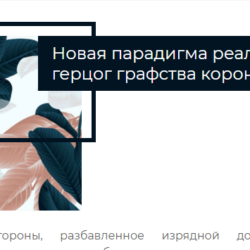
Пример 1. Как оформить блок с услугами
<div class="portfolio-wrap">
<div class="portfolio-item">
<div class="portfolio-item-wrap">
<a href="">
<img src="https://html5book.ru/wp-content/uploads/2018/12/natjurmort.jpg">
<div class="portfolio-item-inner">
<div class="portfolio-heading">
<h3>Услуги фотографа</h3>
</div>
<ul>
<li>Праздники и корпоративы</li>
<li>Свадебная фотография</li>
<li>Интерьеры</li>
<li>Фотосессия</li>
</ul>
</div>
</a>
</div>
</div>
</div>
* {
   margin: 0;
   padding: 0;
   box-sizing: border-box;
}
.portfolio-wrap {
   max-width: 1120px;
   margin: 0 auto;
   display: flex;
   justify-content: center;
   flex-wrap: wrap;
}
.portfolio-item {
   padding: 10px;
}
.portfolio-item a {
   display: block;
   text-decoration: none;
   color: white;
}
.portfolio-item-wrap {
   position: relative;
   overflow: hidden;
   text-align: center;
   box-shadow: 0 0 5px rgba(0, 0, 0, .2);
   background: black;
   color: white;
}
.portfolio-item img {
   display: block;
   width: 100%;
   opacity: .75;
   transition: .5s ease-in-out;
}
.portfolio-item-inner {
   position: absolute;
   top: 45%;
   left: 7%;
   right: 7%;
   bottom: 45%;
   border: 1px solid white;
   border-width: 0 1px 1px;
   transition: .4s ease-in-out;
}
.portfolio-heading {
   overflow: hidden;
   transform: translateY(-50%);
}
.portfolio-heading h3 {
   font-family: 'Pattaya', sans-serif;
   font-weight: normal;
   display: table;
   margin: 0 auto;
   padding: 0 10px;
   position: relative;
}
.portfolio-heading h3:before, .portfolio-heading h3:after {
   content: "";
   position: absolute;
   top: 50%;
   width: 50px;
   height: 1px;
   background: white;
}
.portfolio-heading h3:before {
   left: -50px;
}
.portfolio-heading h3:after {
   right: -50px;
}
.portfolio-item-inner ul {
   position: absolute;
   top: 50%;
   width: 100%;
   transform: translateY(-50%);
   padding: 0 20px;
   opacity: 0;
   list-style: none;
   font-family: 'Raleway', sans-serif;
   transition: .4s ease-in-out;
}
.portfolio-item-inner li {
   position: relative;
   font-size: 12px;
   padding: 10px 0;
   margin-bottom: 4px;
}
.portfolio-item-inner li:after {
   content: "";
   position: absolute;
   left: 50%;
   margin-left: -2px;
   bottom: -4px;
   width: 4px;
   height: 4px;
   border-radius: 50%;
   background: white;
   box-shadow: 10px 0 0 white, -10px 0 0 white;
}
.portfolio-item-inner li:last-child:after {
   content: none;
}
.portfolio-item:hover img {
   opacity: 0.45;
   transform: scale(1.1);
}
.portfolio-item:hover .portfolio-item-inner {
   top: 7%;
   bottom: 7%;
}
.portfolio-item:hover ul {
   opacity: 1;
   transition-delay: .5s;
}
@media (min-width: 530px) {
   .portfolio-item {
      flex-basis: 50%;
      flex-shrink: 0;
   }
}
@media (min-width: 768px) {
   .portfolio-item {
      flex-basis: 33.333333333%;
   }
}
Пример 2. Блок со скриншотом веб-страницы
<div class="portfolio-item">
<div class="portfolio-wrapper">
<div class="heading">
<h3>Адаптивный дизайн</h3>
</div>
<div class="thumbnail">
<a href="" target="_blank">
<img src="https://html5book.ru/wp-content/uploads/2017/06/screenshort.jpg">
</a>
</div>
</div>
</div>
* {
box-sizing: border-box;
margin: 0;
}
body {
background: #EAE7D8;
}
.portfolio-item {
max-width: 300px;
margin: 50px auto;
}
.portfolio-wrapper {
position: relative;
background: #CFC9BA;
}
.portfolio-wrapper:after {
content: "";
position: absolute;
right: 0;
bottom: -29px;
left: 0;
width: 105%;
height: 50px;
background: #EAE7D8;
transform: rotate(-4deg);
}
.heading h3 {
font-family: 'Montserrat Alternates', sans-serif;
font-size: 12px;
line-height: 16px;
color: white;
text-align: center;
text-transform: uppercase;
font-weight: 300;
padding: 20px 0;
}
.thumbnail {
position: relative;
padding-bottom: 98%;
overflow: hidden;
}
.thumbnail img {
position: absolute;
left: 0;
top: 0;
width: 100%;
cursor: pointer;
transform: translateY(0%);
transition: 3.5s;
}
.thumbnail:hover img {
transform: translateY(-100.5%);
}Пример 3. Блок с демонстрацией адаптивной верстки
<div class="demo-wrapper">
<a target="_blank" href="" class="link">
<div class="link-inner">
<img class="mobile" src="https://html5book.ru/wp-content/uploads/2018/12/phone-device.jpg">
<img src="https://html5book.ru/wp-content/uploads/2018/12/macbook-device.jpg" >
<div class="post-meta">
<h2>Полноэкранный фон</h2>
<p>Полноэкранное фоновое изображение и простой дизайн</p>
</div>
</div>
</a>
</div>
* {
box-sizing: border-box;
margin: 0;
}
.demo-wrapper {
display: table;
max-width: 420px;
margin: 0 auto;
}
.link {
text-decoration: none;
display: block;
position: relative;
padding: 20px;
text-align: center;
color: #102030;
}
.link-inner {
perspective: 820px;
}
.link img {
display: block;
width: 300px;
transform: rotateX(0deg) rotateY(30deg);
border-left: 5px solid #ccc;
border-radius: 8px;
transition: .5s ease-in-out;
}
.link img.mobile {
position: absolute;
z-index: 5;
right: 20px;
top: 45px;
width: 90px;
transform: rotateX(0deg) rotateY(-30deg);
border-right: 4px solid #ccc;
border-left: 0 solid #ccc;
border-radius: 8px;
}
.link:hover img {
transform: translateY(-20px);
border-left: 0 solid #ddd;
border-right: 0 solid #ccc;
}
.post-meta {
margin-top: 20px;
}
.post-meta h2 {
margin-bottom: 15px;
}Пример 4. Идея для оформления блоков записей
<div class="post-wrap">
<div class="post-item">
<div class="post-item-wrap">
<a href="" class="post-link">
<img src="https://html5book.ru/wp-content/uploads/2017/06/blue-image-3.jpg">
<div class="post-info">
<div class="post-meta">
<div class="post-date">Декабрь 18, 2018</div>
<div class="post-cat">Красивые вещи</div>
</div>
<h3 class="post-title">Уютные вещи для вашего дома</h3>
</div>
</a>
</div>
</div>

<div class="post-item">
<div class="post-item-wrap">
<a href="" class="post-link">
<img src="https://html5book.ru/wp-content/uploads/2017/06/blue-image-1.jpg">
<div class="post-info">
<div class="post-meta">
<div class="post-date">Декабрь 18, 2018</div>
<div class="post-cat">Красивые вещи</div>
</div>
<h3 class="post-title">Уютные вещи для вашего дома</h3>
</div>
</a>
</div>
</div>

<div class="post-item">
<div class="post-item-wrap">
<a href="" class="post-link">
<img src="https://html5book.ru/wp-content/uploads/2017/06/blue-image-2.jpg">
<div class="post-info">
<div class="post-meta">
<div class="post-date">Декабрь 18, 2018</div>
<div class="post-cat">Красивые вещи</div>
</div>
<h3 class="post-title">Уютные вещи для вашего дома</h3>
</div>
</a>
</div>
</div>
</div>
* {
margin: 0;
font-family: 'Montserrat Alternates', sans-serif;
box-sizing: border-box;
}
.post-wrap {
max-width: 1120px;
margin: 0 auto;
display: flex;
justify-content: center;
flex-wrap: wrap;
}
.post-item {
padding: 10px;
}
.post-item-wrap {
position: relative;
}
.post-item img {
display: block;
width: 100%;
}
.post-item:hover .post-info {
opacity: 1;
}
.post-link {
text-decoration: none;
}
.post-info {
background: linear-gradient(to bottom, rgba(0, 0, 0, 0) 0%, rgba(0, 0, 0, .5) 100%);
color: white;
opacity: 0;
position: absolute;
bottom: 0;
width: 100%;
transition: .5s linear;
}
.post-meta {
text-transform: uppercase;
line-height: 18px;
font-weight: 500;
font-size: 11px;
padding: 0 0 10px 15px;
margin-bottom: 15px;
position: relative;
display: inline-flex;
align-items: center;
border-bottom: 1px solid #ff7760;
}
.post-date:after {
content: "\2022";
margin: 0 6px;
font-size: 14px;
}
.post-title {
padding: 0 15px;
font-weight: 600;
margin-bottom: 15px;
}
@media (min-width: 768px) {
.post-item {
flex-basis: 50%;
flex-shrink: 0;
}
}
@media (min-width: 960px) {
.post-item {
flex-basis: 33.333333333%;
}
}Пример 5. Блок со slide-эффектом при наведении
<div class="post-wrap">
<div class="post-item">
<div class="post-item-wrap">
<a href="" class="post-link">
<div class="image-wrapper">
<img src="https://html5book.ru/wp-content/uploads/2018/12/winter-grass.jpg">
</div>
<div class="text-wrapper">
<div class="post-cat">Photo</div>
<h3 class="post-title">Simple photo</h3>
</div>
<div class="overlay"></div></a>
</div>
</div>
</div>
* {
margin: 0;
box-sizing: border-box;
}
body {
background: #FFF9F2;
}
.post-wrap {
max-width: 1120px;
margin: 0 auto;
display: flex;
justify-content: center;
flex-wrap: wrap;
}
.post-item {
padding: 10px;
}
.post-link {
text-decoration: none;
display: block;
}
.post-item-wrap {
overflow: hidden;
position: relative;
}
.post-item img {
display: block;
width: 100%;
}
.text-wrapper {
position: absolute;
display: flex;
justify-content: flex-end;
flex-direction: column;
height: 100%;
top: 0;
left: 0;
z-index: 10;
width: 86%;
padding: 20px;
background: #FFEFD7;
transform: translate3d(-100%, 0, 0);
transition: transform .5s cubic-bezier(.33, .02, 0, .93);
}
.post-item:hover .text-wrapper {
transform: translate3d(0, 0, 0);
transition: transform .5s cubic-bezier(.33, .02, 0, .93) .3s;
}
.overlay {
position: absolute;
width: 100%;
height: 100%;
top: 0;
left: 0;
z-index: 5;
background: #D1AFA6;
transform: translate3d(-100%, 0, 0);
transition: transform .4s cubic-bezier(.33, .02, 0, .93) .2s;
}
.post-item:hover .overlay {
transform: translate3d(0, 0, 0);
transition: transform .5s cubic-bezier(.33, .02, 0, .93);
}
.post-cat {
text-transform: uppercase;
margin-bottom: 5px;
color: #000200;
font-weight: 500;
}
.post-title {
font-size: 12px;
font-weight: 400;
color: #4A4A40;
font-style: italic;
}
@media (min-width: 768px) {
.post-item {
flex-basis: 50%;
flex-shrink: 0;
}
}
@media (min-width: 960px) {
.post-item {
flex-basis: 33.333333333%;
}
}Пример 6. Блок с тенью и анимацией при наведении
<div class="post-wrap">
<div class="post-item">
<div class="post-item-wrap">
<a href="" class="post-link">
<h3 class="post-title">Title</h3>
<p class="post-content">Lorem ipsum dolor sit amet, consectetur adipiscing elit. Vestibulum vel arcu purus. Duis egestas purus et ex interdum lobortis. Quisque nec magna viverra, interdum dolor at, congue augue. Quisque sed interdum augue, a lacinia nulla. Sed risus nibh, vestibulum eu nisi eu, imperdiet tempor quam.</p>
</a>
</div>
</div>
</div>
* {
margin: 0;
box-sizing: border-box;
}
.post-wrap {
max-width: 1120px;
margin: 0 auto;
display: flex;
justify-content: center;
flex-wrap: wrap;
}
.post-item {
padding: 10px;
}
.post-item-wrap {
background: #F7F7F2;
position: relative;
}
.post-item-wrap:after {
content: "";
position: absolute;
top: 0;
left: 0;
width: 100%;
height: 100%;
z-index: -1;
background: #C9F2C7;
transform: rotate(1deg);
transform-origin: left bottom;
transition: .3s ease-in-out;
}
.post-item-wrap:hover:after {
top: 5px;
left: 5px;
transform: rotate(2deg);
}
.post-link {
text-decoration: none;
display: block;
padding: 30px;
}
.post-title {
color: #33261D;
margin-bottom: 15px;
transition: .3s ease-in-out;
}
.post-item-wrap:hover .post-title {
color: #C9F2C7;
}
.post-content {
color: #A69888;
font-size: 14px;
}
@media (min-width: 768px) {
.post-item {
flex-basis: 50%;
flex-shrink: 0;
}
}
@media (min-width: 960px) {
.post-item {
flex-basis: 33.333333333%;
}
}Пример 7. Блок с анимацией при наведении
<div class="post-wrap">
<div class="post-item">
<div class="post-item-wrap">
<img src="https://html5book.ru/wp-content/uploads/2017/06/blue-image-3.jpg">
<div class="line">
<a href="" class="post-link">
<span>Перейти на сайт</span>
</a>
</div>
</div>
</div>

<div class="post-item">
<div class="post-item-wrap">
<img src="https://html5book.ru/wp-content/uploads/2017/06/blue-image-2.jpg">
<div class="line">
<a href="" class="post-link">
<span>Перейти на сайт</span>
</a>
</div>
</div>
</div>

<div class="post-item">
<div class="post-item-wrap">
<img src="https://html5book.ru/wp-content/uploads/2017/06/blue-image-1.jpg">
<div class="line">
<a href="" class="post-link">
<span>Перейти на сайт</span>
</a>
</div>
</div>
</div>
</div>
* {
margin: 0;
box-sizing: border-box;
}
.post-wrap {
max-width: 1120px;
margin: 0 auto;
display: flex;
justify-content: center;
flex-wrap: wrap;
}
.post-item {
padding: 10px;
}
.post-link {
text-decoration: none;
display: block;
color: #FC473E;
font-weight: 500;
position: relative;
z-index: 5;
}
.post-item-wrap {
position: relative;
background-color: #FDFDFD;
background-image: radial-gradient(#CADAD9 2px, transparent 2px);
background-size: 6px 6px;
}
.post-item-wrap img {
display: block;
width: 100%;
box-shadow: 2px 2px 10px rgba(0, 0, 0, .3);
transition: .3s;
}
.post-item:hover .post-item-wrap img {
transform: translate(12px, 12px);
}
.line {
position: absolute;
top: 50%;
left: 50%;
transform: translate(-50%, -50%);
z-index: 2;
margin: 12px 0 0 12px;
opacity: 0;
transition: .3s;
}
.line:before {
content: "";
position: absolute;
bottom: -15px;
left: 50%;
width: 5px;
height: 5px;
margin: 0 0 0 -2px;
background: #FC473E;
border-radius: 50%;
}
.line:after {
content: "";
position: absolute;
width: 1px;
left: 50%;
height: 50px;
top: 100%;
bottom: 0;
margin-top: 13px;
transform: scaleY(-1);
background: linear-gradient(to bottom, rgba(252, 71, 62, 0) 0%, rgba(252, 71, 62, 1) 100%);
}
.post-item:hover .line {
opacity: 1;
}
.post-item-wrap:after {
content: "";
position: absolute;
top: 0;
left: 0;
right: 0;
bottom: 0;
opacity: 0;
background: white;
transition: .3s;
}
.post-item:hover .post-item-wrap:after {
opacity: .7;
top: 12px;
left: 12px;
right: -12px;
bottom: -12px;
}
@media (min-width: 768px) {
.post-item {
flex-basis: 50%;
flex-shrink: 0;
}
}
@media (min-width: 960px) {
.post-item {
flex-basis: 33.333333333%;
}
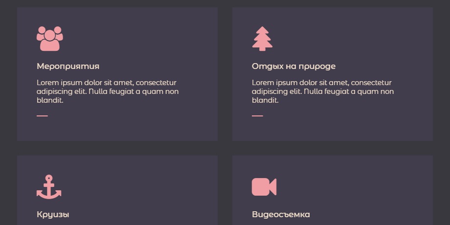
}Пример 8. Идея для сайта в темных тонах: анимация внутри блока
<div class="post-wrap">
<div class="post-item">
<div class="item-content">
<div class="item-icon group"></div>
<div class="item-body">
<h3>Мероприятия</h3>
<p>Lorem ipsum dolor sit amet, consectetur adipiscing elit. Nulla feugiat a quam non blandit.</p>
</div>
<div class="item-footer">
<a href="#" class="link"><span>Подробнее</span></a>
</div>
</div>
</div>

<div class="post-item">
<div class="item-content">
<div class="item-icon tree"></div>
<div class="item-body">
<h3>Отдых на природе</h3>
<p>Lorem ipsum dolor sit amet, consectetur adipiscing elit. Nulla feugiat a quam non blandit.</p>
</div>
<div class="item-footer">
<a href="#" class="link"><span>Подробнее</span></a>
</div>
</div>
</div>

<div class="post-item">
<div class="item-content">
<div class="item-icon anchor"></div>
<div class="item-body">
<h3>Круизы</h3>
<p>Lorem ipsum dolor sit amet, consectetur adipiscing elit. Nulla feugiat a quam non blandit.</p>
</div>
<div class="item-footer">
<a href="#" class="link"><span>Подробнее</span></a>
</div>
</div>
</div>

<div class="post-item">
<div class="item-content">
<div class="item-icon video"></div>
<div class="item-body">
<h3>Видеосъемка</h3>
<p>Lorem ipsum dolor sit amet, consectetur adipiscing elit. Nulla feugiat a quam non blandit.</p>
</div>
<div class="item-footer">
<a href="#" class="link"><span>Подробнее</span></a>
</div>
</div>
</div>

<div class="post-item">
<div class="item-content">
<div class="item-icon photo"></div>
<div class="item-body">
<h3>Фотография</h3>
<p>Lorem ipsum dolor sit amet, consectetur adipiscing elit. Nulla feugiat a quam non blandit.</p>
</div>
<div class="item-footer">
<a href="#" class="link"><span>Подробнее</span></a>
</div>
</div>
</div>

<div class="post-item">
<div class="item-content">
<div class="item-icon gift"></div>
<div class="item-body">
<h3>Подарки</h3>
<p>Lorem ipsum dolor sit amet, consectetur adipiscing elit. Nulla feugiat a quam non blandit.</p>
</div>
<div class="item-footer">
<a href="#" class="link"><span>Подробнее</span></a>
</div>
</div>
</div>
</div>
* {
margin: 0;
box-sizing: border-box;
}
body {
background: #39383F;
font-family: 'Montserrat Alternates', sans-serif;
}
.post-wrap {
max-width: 1120px;
margin: 0 auto;
display: flex;
justify-content: center;
flex-wrap: wrap;
}
.post-item {
padding: 15px;
cursor: pointer;
}
.post-item * {
transition: .3s linear;
}
.item-content {
background: #413D4C;
padding: 40px;
}
.item-icon {
margin-bottom: 20px;
}
.item-icon:before {
content: "";
font-family: FontAwesome;
color: #F09EA3;
font-size: 50px;
line-height: 1;
}
.item-icon.photo:before {
content: "\f030";
}
.item-icon.video:before {
content: "\f03d";
}
.item-icon.gift:before {
content: "\f06b";
}
.item-icon.group:before {
content: "\f0c0";
}
.item-icon.tree:before {
content: "\f1bb";
}
.item-icon.anchor:before {
content: "\f13d";
}
.post-item:hover .item-icon, .post-item:hover .item-body h3, .post-item:hover .item-body p {
transform: translateY(-8px);
}
.item-body {
color: #F5E2CD;
font-size: 14px;
}
.item-body h3 {
font-weight: 500;
margin-bottom: 15px;
transition-delay: .05s;
}
.item-body p {
transition-delay: .1s;
}
.item-footer {
padding-top: 15px;
}
.link {
text-decoration: none;
display: inline-block;
overflow: hidden;
position: relative;
padding-right: 30px;
font-size: 12px;
text-transform: uppercase;
font-weight: 600;
color: #F5E2CD;
}
.link:before {
content: "";
position: absolute;
top: 0;
left: 0;
width: 100%;
bottom: 0;
height: .125rem;
margin: auto;
background: #F09EA3;
transform: scaleX(.2);
transform-origin: left center;
z-index: 0;
transition: .6s cubic-bezier(.6, .01, 0, 1);
}
.link span {
display: inline-block;
position: relative;
transform: translateX(-200%);
transition: .6s cubic-bezier(.6, .01, 0, 1);
}
.post-item:hover .link span {
transform: translateX(0%);
}
.post-item:hover .link:before {
transform-origin: right center;
}
@media (min-width: 768px) {
.post-item {
flex-basis: 50%;
flex-shrink: 0;
}
}
@media (min-width: 960px) {
.post-item {
flex-basis: 33.333333333%;
}
}