Эффекты наложения
В веб-дизайне существует приём, создающий контраст при наложении текста на полноэкранные фоновые изображения или видео. Это приём называется эффект наложения и включает в себя различные типы эффектов.
Перейти на страницу с примерами
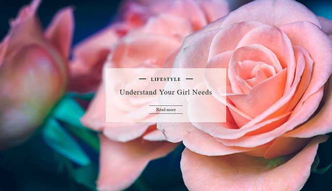
1. Полупрозрачный фон
Один из часто используемых методов акцентирования на текстовом содержимом — размещение текста внутри полупрозрачного блока. Для достижения наилучшего контраста для заливки блока обычно используются оттенки чёрного, серого или белого, но также могут быть использованы и более яркие цвета.
<div class="image-caption">
  <div class="category"><a href="">Lifestyle</a></div>
  <h2 class="post-title"><a href="">Understand Your Girl Needs</a></h2>
  <div class="post-readmore"><a href="">Read more</a></div>
</div>
body {
margin: 0;
background-image: url(https://html5book.ru/wp-content/uploads/2017/01/photo-roses.jpg);
background-position: center center;
background-repeat: no-repeat;
background-size: cover;
position: relative;
height: 100vh;
text-align: center;
}
.image-caption {
transform: translate(-50%, -50%);
position: absolute;
top: 50%;
left: 50%;
padding: 30px 50px;
background: rgba(255,255,255,.6);
}
.image-caption a {
text-decoration: none;
color: #212121;
transition: .25s ease-in-out;
}
.image-caption a:hover,
.image-caption a:focus {
color: #f17d80;
outline: 0;
}
.category {
position: relative;
padding: 0 25px;
display: inline-block;
}
.category a {
font-weight: bold;
text-transform: uppercase;
display: inline-block;
padding: 0 .75em;
line-height: 1.2em;
margin: 0 .3em;
letter-spacing: 2px;
}
.category:before, .category:after {
content: "";
position: absolute;
top: 50%;
margin-top: -2px;
width: 25px;
border-bottom: 2px solid;
}
.category:before {left: 0;}
.category:after {right: 0;}
.post-title {margin-bottom: 30px;}
.post-title a {
text-transform: capitalize;
font-size: 26px;
letter-spacing: .05em;
font-weight: normal;
line-height: 1.35;
}
.post-readmore a {
display: inline-block;
padding: 5px 25px;
border-top: 1px solid;
border-bottom: 1px solid;
}
.post-readmore a:hover {
background: #f17d80;
color: #fff;
border-color: #f17d80;
}2. Затухающий градиент
Применение градиента, который растворяется по краям изображения, добавляет эффект, который усиливает контраст фона с текстовым содержимым. Для создания подобного эффекта можно использовать как оттенки черного, серого или белого, а также яркие цвета для чёрно-белых изображений.
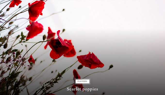
<h2>Scarlet poppies</h2>body {
margin: 0;
height: 100vh;
position: relative;
background-image: url(https://html5book.ru/wp-content/uploads/2016/12/photo-8.jpg);
background-repeat: no-repeat;
background-position: center;
background-size: cover;
}
body:before {
content: "";
position: absolute;
left: 0;
bottom: 0;
height: 70%;
width: 100%;
background: linear-gradient(to bottom, rgba(0, 0, 0, 0), rgba(0, 0, 0, 0.7));
}
h2 {
margin: 0;
position: absolute;
bottom: 15px;
left: 50%;
transform: translateX(-50%);
padding: 10px;
box-sizing: border-box;
text-align: center;
color: white;
font-weight: normal;
letter-spacing: 2px;
}
h2:before {
content: "Flowers";
position: absolute;
top: -40px;
left: 50%;
transform: translateX(-50%);
background: white;
color: #212121;
text-transform: uppercase;
font-size: 12px;
padding: 7px 15px;
outline: 1px solid white;
outline-offset: 4px;
}3. Тонированный фон
Для чёрно-белых изображений можно воспользоваться приёмом тонирования, наложив поверх основного фона полупрозрачный цвет.
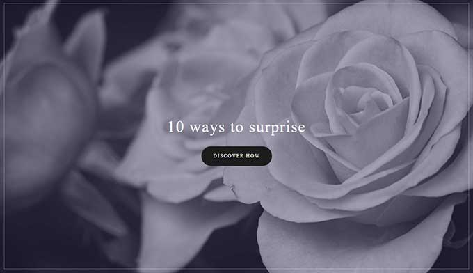
<div class="wrap">
  <h2>10 ways to surprise</h2>
  <div><a href="">discover how</a></div>
</div>
body {
margin: 0;
height: 100vh;
background: url('https://html5book.ru/wp-content/uploads/2017/01/photo-7-cb.jpg');
background-repeat: no-repeat;
background-position: center;
background-size: cover;
position: relative;
}
body:before {
content: "";
position: absolute;
left: 0;
top: 0;
width: 100%;
height: 100%;
background: rgba(51,44,85,.4);
}
body:after {
content: "";
position: absolute;
top: 10px;
right: 10px;
bottom: 10px;
left: 10px;
z-index: 1;
border: 1px solid rgba(255,255,255,0.3);
}
.wrap {
transform: translate(-50%, -50%);
position: absolute;
top: 50%;
left: 50%;
padding: 30px 50px;
z-index: 3;
text-align: center;
}
h2 {
color: white;
font-size: 40px;
font-weight: normal;
letter-spacing: 2px;
padding: 27px 0;
margin: 0;
}
.wrap a {
display: inline-block;
background: #222222;
border: 2px solid #222222;
padding: 15px 28px;
border-radius: 30px;
text-decoration: none;
font-size: 12px;
color: #fff;
letter-spacing: 2px;
text-transform: uppercase;
transition: .5s linear;
}
.wrap a:hover {animation: 1s tada infinite linear;}
@keyframes tada {
0% {transform: scale3d(1, 1, 1);}
10%, 20% {transform: scale3d(.9, .9, .9) rotate3d(0, 0, 1, -3deg);}
30%, 50%, 70%, 90% {transform: scale3d(1.1, 1.1, 1.1) rotate3d(0, 0, 1, 3deg);}
40%, 60%, 80% {transform: scale3d(1.1, 1.1, 1.1) rotate3d(0, 0, 1, -3deg);}
100% {transform: scale3d(1, 1, 1);}
}4. Размытый фон
Размытый фон также создаёт ощутимый контраст между фоном и текстом, не отвлекая глаза от важного контента на странице.
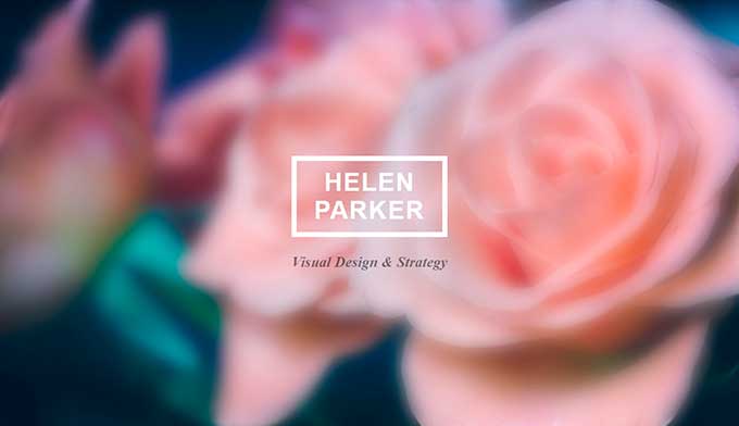
<div class="wrap">
<h2>Helen<br>Parker</h2>
<p>Visual Design & Strategy</p>
</div>body {
margin: 0;
background-image: url(https://html5book.ru/wp-content/uploads/2017/01/photo-roses.jpg);
background-position: center center;
background-repeat: no-repeat;
background-attachment: fixed;
background-size: cover;
position: relative;
height: 100vh;
}
body:before {
content: "";
position: absolute;
top: 0;
left: 0;
width: 100%;
height: 100%;
background-image: url(https://html5book.ru/wp-content/uploads/2017/01/photo-roses.jpg);
background-position: center center;
background-repeat: no-repeat;
background-attachment: fixed;
background-size: cover;
-webkit-filter: blur(15px) opacity(90%);
filter: blur(15px) opacity(90%);
}
.wrap {
transform: translate(-50%, -50%);
position: absolute;
top: 50%;
left: 50%;
text-align: center;
}
.wrap h2 {
font-size: 40px;
color: white;
letter-spacing: 2px;
border: 8px solid;
padding: 12px 15px;
margin: 0;
text-transform: uppercase;
text-align: center;
font-family: arial;
}
.wrap p {
font-style: italic;
color: rgba(0,0,0,.5);
font-size: 24px;
font-weight: bold;
padding-top: 16px;
margin: 0;
}5. Сетчатый фон
С помощью пиксельного градиента или узора-изображения можно приглушить фон, а также скрыть плохое качество изображения или фонового видео.

<h2>Helen<br>Parker</h2>body {
margin: 0;
background-image: url(https://html5book.ru/wp-content/uploads/2017/01/photo-roses.jpg);
background-position: center center;
background-repeat: no-repeat;
background-attachment: fixed;
background-size: cover;
position: relative;
height: 100vh;
}
body:before {
content: "";
position: absolute;
top: 0;
left: 0;
width: 100%;
height: 100%;
background: url(https://html5book.ru/wp-content/uploads/2017/01/stripe-black.png);
}
h2 {
transform: translate(-50%, -50%);
position: absolute;
top: 50%;
left: 50%;
z-index:3;
font-size: 40px;
color: white;
letter-spacing: 2px;
border: 8px solid;
padding: 12px 15px;
margin: 0;
text-transform: uppercase;
font-family: arial;
text-align: center;
}