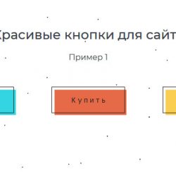
Красивые кнопки для сайта. Часть 3
Очередная коллекция красивых эффектов для кнопок на сайте, созданных с помощью анимации теней, псевдоэлементов и иконок.
Перейти на страницу с примерами
Пример 1. Кнопка с анимированной тенью и стрелкой
<button class="shadow-btn">
<span class="btn-inner">
<span class="text">Перейти</span>
<i class="fa fa-long-arrow-right"></i>
</span>
<span class="shadow"></span>
</button>
.shadow-btn {
position: relative;
padding: 15px 40px;
margin: 0 20px;
background: #fff9ef;
font-family: 'Montserrat Alternates', sans-serif;
color: #fe7660;
text-transform: lowercase;
border: 2px solid #052464;
font-size: 16px;
font-weight: 600;
outline: none;
cursor: pointer;
}
.btn-inner {
display: flex;
align-items: center;
}
.text {
line-height: 1;
transform: translateX(0px);
transition: .3s cubic-bezier(.86, 0, .07, 1);
}
.btn-inner i {
margin-left: 5px;
font-size: 14px;
transition: transform .3s cubic-bezier(.86, 0, .07, 1), opacity .3s;
}
.shadow {
position: absolute;
top: 9px;
left: 9px;
width: 100%;
height: 100%;
background: #98dfd7;
z-index: -1;
transition: .3s ease;
transform: translate3d(0, 0, 0);
}
.shadow-btn:hover .text {
transform: translateX(8px);
}
.shadow-btn:hover i {
transform: translateX(100%);
opacity: 0;
}
.shadow-btn:hover .shadow {
transform: translate3d(3px, 3px, 0);
}Пример 2. Кнопки с анимированной тенью при наведении
<button class="btn btn1">
<span class="text">Перейти</span>
</button>
<button class="btn btn2">
<span class="text">Перейти</span>
</button>
<button class="btn btn3">
<span class="text">Перейти</span>
</button>
.btn {
padding: 15px 30px;
margin: 0 20px;
color: #f83b3b;
font-family: 'Montserrat Alternates', sans-serif;
border: 3px solid;
background: white;
outline: none;
cursor: pointer;
}
.text {
position: relative;
display: inline;
vertical-align: middle;
font-size: 23px;
font-weight: 600;
z-index: 5;
}
.btn1 .text:after {
content: "";
position: absolute;
bottom: 0;
height: 15px;
background: #f29f97;
left: -5px;
width: calc(100% + 10px);
z-index: -1;
transform: scaleX(1);
transform-origin: 0 0;
transition: .3s cubic-bezier(.075, .82, .165, 1);
}
.btn1:hover .text:after {
transform: scaleX(0);
}
.btn2 .text:after {
content: "";
position: absolute;
bottom: auto;
top: 0;
left: 0;
height: 0%;
width: 100%;
background: #f29f97;
z-index: -1;
transition: .3s ease;
}
.btn2:hover .text:after {
height: 100%;
bottom: 0;
top: auto;
}
.btn3 .text:after {
content: "";
position: absolute;
bottom: 0;
height: 15px;
background: #f29f97;
left: 0;
width: 100%;
z-index: -1;
transform: scaleY(1);
transform-origin: left bottom;
transition: .3s cubic-bezier(.075, .82, .165, 1);
}
.btn3:hover .text:after {
transform: scaleY(0);
}Пример 3. Split-кнопка
<button class="btn">
<span class="text">В корзину</span>
</button>
.btn {
position: relative;
padding: 15px 30px;
margin: 0 20px;
font-family: 'Montserrat Alternates', sans-serif;
color: white;
font-weight: 600;
background: #c81965;
border-width: 0;
outline: none;
cursor: pointer;
}
.btn:before, .btn:after {
content: "";
position: absolute;
height: 50%;
width: 100%;
background: #c81965;
transition: .3s cubic-bezier(.75, .24, .01, .9);
}
.btn:before {
top: 0;
right: -5px;
}
.btn:after {
bottom: 0;
left: -5px;
}
.btn:hover:before {
transform: translateX(-5px);
}
.btn:hover:after {
transform: translateX(5px);
}
.btn2, .btn2:before, .btn2:after {
background: #1f0b2f;
}
.text {
position: relative;
z-index: 2;
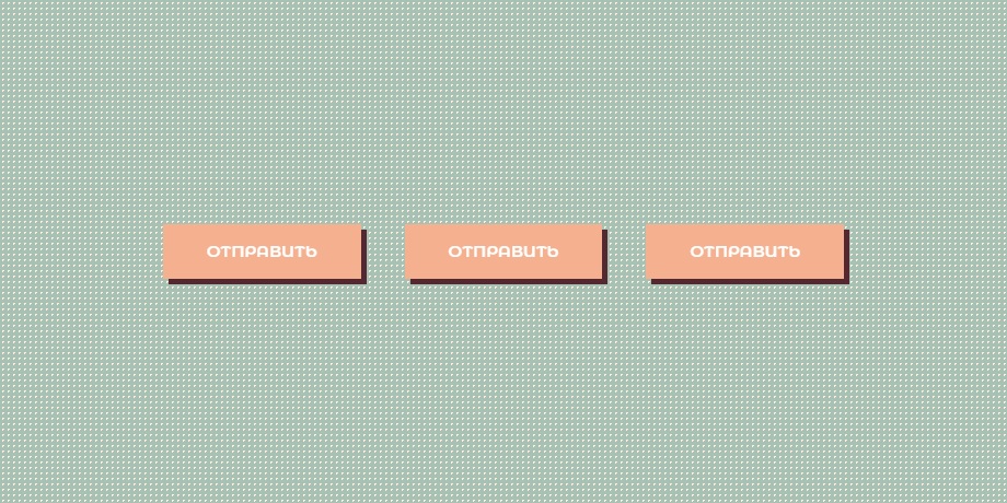
}Пример 4. Кнопка с эффектом волны при наведении
<button class="btn">Отправить</button>.btn {
position: relative;
overflow: hidden;
z-index: 1;
padding: 10px 40px;
margin: 0 20px;
font-family: 'Montserrat Alternates', sans-serif;
font-weight: 600;
line-height: 30px;
color: white;
font-size: 15px;
text-transform: uppercase;
background: #f5b08f;
border-width: 0;
box-shadow: 5px 5px 0 #532831;
outline: none;
cursor: pointer;
transition: 1.5s;
}
.btn:before, .btn:after {
content: "";
position: absolute;
height: 200px;
left: -50%;
margin-top: -100px;
top: 50%;
width: 200px;
border-radius: 50%;
opacity: 0.3;
z-index: -1;
transform: scale(0);
}
.btn:before {
background: #ffeede;
transition: .8s ease-out;
}
.btn:after {
transition: .4s ease-in .3s;
}
.btn:hover {
color: #532831;
}
.btn:hover:before, .btn:hover:after {
opacity: 1;
transform: scale(4);
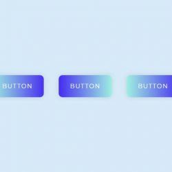
}Пример 5. Slide-эффект при наведении на кнопку
<button class="btn btn1">В корзину</button>
<button class="btn btn2">В корзину</button>
<button class="btn btn3">В корзину</button>
.btn {
margin: 0 20px;
padding: 15px 34px;
overflow: hidden;
font-family: 'Montserrat Alternates', sans-serif;
color: white;
letter-spacing: 1px;
text-transform: uppercase;
font-weight: 600;
border-width: 0;
transform: matrix3d(1, 0, 0, 0, 0, 1, 0, 0, 0, 0, 1, 0, 0, 0, 0, 1);
outline: none;
cursor: pointer;
}
.btn1 {
background: linear-gradient(90deg, #c600b2, #7619fd);
}
.btn2 {
background: linear-gradient(90deg, #a3ffb0, #2bd9e8);
}
.btn3 {
background: linear-gradient(90deg, #49c2ff, #6a27d2);
}
.btn:before, .btn:after {
content: "";
position: absolute;
z-index: -1;
width: 100%;
height: 100%;
left: -110%;
top: 0;
opacity: 0.1;
background: black;
transform: skewX(25deg);
transition: .5s ease;
}
.btn:hover:before {
left: -10%;
transition: .3s ease;
}
.btn:hover:after {
left: -20%;
}Пример 6. Кнопка с тенью и иконкой
<button class="btn">Отправить</button>.btn {
position: relative;
height: 40px;
line-height: 40px;
padding: 0 30px 0 40px;
margin: 0 20px;
background: linear-gradient(-135deg, #00E5FE, #4463FE);
box-shadow: 0 15px 65px #4753FF;
border-width: 0;
border-radius: 50px;
font-family: 'Montserrat Alternates', sans-serif;
font-size: 14px;
color: white;
outline: none;
cursor: pointer;
}
.btn:before {
content: "\f067";
position: absolute;
left: 5px;
top: 5px;
font-family: FontAwesome;
color: white;
width: 30px;
height: 30px;
line-height: 30px;
text-align: center;
border-radius: 50%;
background: transparent;
transition: .3s ease-in-out;
}
.btn:hover:before {
background: white;
color: #24D8F7;
}