Красивые рамки для текста и фото на сайте
Используя различные техники, можно создать уникальный дизайн элементов страницы. Градиентные узоры, элементы декора, созданные с помощью псевдоэлементов, тень блока — всё это поможет сделать красивые рамки для фотографий и блоков текста.
Во всех примерах ширина блока, если не задана явно, определяется шириной блока-контейнера, в который он вложен. Также в примерах используются шрифты Google Fonts.
Перейти на страницу с примерами
Пример 1.
<div class="section">
  <div class="border">
    <p>
      <img src="https://html5book.ru/wp-content/uploads/2017/02/rose-transparent.png">
      <span>Весеннее<br> предложение</span>
    </p>
  </div>
</div>
body {background: #FCE0CA;}
.section {text-align: center;}
.border {
position: relative;
display: inline-block;
}
.border img {
display: block;
width: 350px;
}
.border:before,
.border:after {
content: "";
width: 300px;
height: 300px;
border: 6px solid #FBF6F2;
position: absolute;
top: 20px;
left: 40px;
z-index: 2;
}
.border:after {
top: -10px;
left: 10px;
z-index: -1;
}
.border p {
position: relative;
text-align: center;
margin: 0;
}
.border p:before,
.border p:after {
content: "";
width: 15px;
height: 15px;
border-radius: 50%;
background: #FBF6F2;
position: absolute;
}
.border p:before {
top: -10px;
right: 0;
}
.border p:after {
bottom: -45px;
left: 10px;
}
.border span {
transform: translate(-50%, -50%);
position: absolute;
top: 50%;
left: 50%;
font-size: 30px;
z-index: 3;
font-family: 'Merriweather', serif;
font-style: italic;
color: #FCE0CA;
text-shadow: 1px 1px 2px rgba(0,0,0,.5);
}Пример 2.
<div class="frame-outer">
  <div class="frame-inner">
    <p>...</p>
  </div>
</div>
body {background: #F9F9F9;}
.frame-outer {
position: relative;
width: 70%;
margin: 0 auto;
border: 10px solid #D7CDC7;
padding: 10px;
}
.frame-inner {
text-align: center;
position: relative;
border: 10px solid #D7CDC7;
}
.frame-outer:before,
.frame-outer:after,
.frame-inner:before,
.frame-inner:after {
content: "";
position: absolute;
width: 40px;
height: 40px;
background-color: #F9F9F9;
background-image: linear-gradient(90deg, #DB9E3D 33%, rgba(255,255,255,0) 33%, rgba(255,255,255,0) 66%, #DB9E3D 66%, #DB9E3D),
linear-gradient(90deg, #DB9E3D 33%, rgba(255,255,255,0) 33%, rgba(255,255,255,0) 66%, #DB9E3D 66%, #DB9E3D);
background-repeat: no-repeat;
background-size: 30px 10px;
background-position: 0 0, 0 20px;
}
.frame-outer:before {
left: -10px;
top: -10px;
z-index: 3;
}
.frame-outer:after {
right: -10px;
top: -10px;
z-index: 3;
background-position: 10px 0, 10px 20px;
}
.frame-inner:before {
left: -30px;
bottom: -30px;
background-position: 0 10px, 0px 30px;
}
.frame-inner:after {
right: -30px;
bottom: -30px;
background-position: 10px 10px, 10px 30px;
}
.frame-inner p {
font-family: 'Open Sans', sans-serif;
font-style: italic;
font-size: 18px;
color: #7A7B82;
line-height: 1.5;
}Пример 3.
<div class="wrap">
  <p><span>Дарите женщинам цветы</span><br>
     <span>Одной улыбки милой ради,</span><br>
     <span>На календарь тайком не глядя,</span><br>
     <span>Без повода, а просто так.</span>
  </p>
</div>
.wrap {
text-align: center;
background: linear-gradient(70deg, #C5FCFF 9px,rgba(255,255,255,0) 10px),
linear-gradient(-70deg, #C5FCFF 9px, rgba(255,255,255,0) 10px),
radial-gradient(#C5FCFF 9px, rgba(255,255,255,0) 10px),
linear-gradient(70deg, #C5FCFF 9px, rgba(255,255,255,0) 10px),
linear-gradient(-70deg, #C5FCFF 9px, rgba(255,255,255,0) 10px),
radial-gradient(#C5FCFF 9px, rgba(255,255,255,0) 10px);
background-position: 30px -30px, -30px -30px, 0 0, 0 0, 0 0, 30px 30px;
background-size: 60px 60px;
background-color: white;
background-repeat: repeat;
padding: 30px 50px;
position: relative;
}
.wrap span {
font-family: 'Open Sans', sans-serif;
font-style: italic;
background: #fdfefe;
box-shadow: 2px 2px 0 #37D2D7;
font-size: 16px;
color: #7A7B82;
line-height: 1.5;
padding: 5px 20px;
display: inline-block;
margin-bottom: 5px;
}Пример 4.
<div class="wrap">
  <h3>Мой профиль</h3>
  <p><img src="https://html5book.ru/wp-content/uploads/2016/10/profile-image.png"></p>
  <p>Lorem ipsum...</p>
  <p><a href="">Смотреть профиль</a></p>
</div>
.wrap {
width: 260px;
height: 440px;
margin: 0 auto;
padding: 20px;
box-sizing: border-box;
background: white;
text-align: center;
font-family: 'Open Sans', sans-serif;
position: relative;
}
.wrap:after {
content: "";
position: absolute;
width: 0;
height: 0;
border-left: 200px solid #CCF9F6;
border-top: 220px solid #FFCE86;
border-right: 200px solid #FF9B6C;
border-bottom: 220px solid #CCF9F6;
z-index: -1;
left: -70px;
top: 0;
}
.wrap p {
font-size: 14px;
line-height: 1.5;
}
.wrap a {
text-decoration: none;
color: #FF9B6C;
font-weight: bold;
}Пример 5.
<div class="wrap">
  <p>текст</p>
</div>
.wrap {
background: linear-gradient(90deg, #EFEFE7 50%, #BCE8EA 50%);
position: relative;
padding: 40px;
box-sizing: border-box;
}
.wrap:before,
.wrap:after {
content: "";
position: absolute;
width: 50%;
height: 10px;
background: linear-gradient(90deg, #BCE8EA 50%, #EFEFE7 50%);
left: 25%;
}
.wrap:before {top: 15px;}
.wrap:after {bottom: 15px;}
.wrap p {
background: white;
margin: 0;
padding: 50px 0;
text-align: center;
font-family: 'Open Sans', sans-serif;
font-style: italic;
color: #7A7B82;
line-height: 1.5;
}Пример 6.
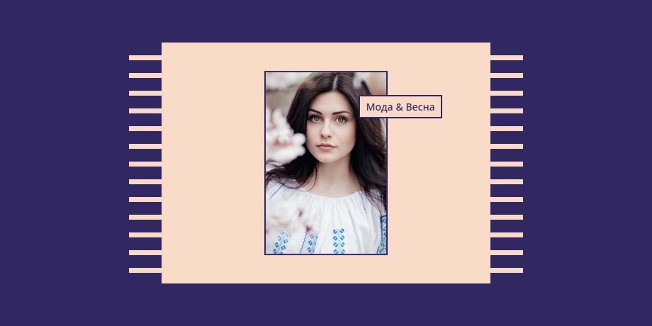
<div class="border">
  <div class="image-container">
    <div><img src="https://html5book.ru/wp-content/uploads/2017/03/alexandru-zdrobau-98438.jpg"></div>
    <h3>Мода & Весна</h3>
  </div>
</div>
.border {
height: 400px;
background: #312861;
padding: 30px 40px;
box-sizing: border-box;
}
.image-container {
position: relative;
width: 80%;
height: 100%;
margin: 0 auto;
background: #F9DAC8;
}
.image-container:before,
.image-container:after {
content: "";
position: absolute;
top: 0;
width: 10%;
height: 100%;
background: repeating-linear-gradient(180deg, rgba(255,255,255,0), rgba(255,255,255,0) 18px, #F9DAC8 18px, #F9DAC8 25px);
}
.image-container:before {left: -10%}
.image-container:after {right: -10%}
.image-container img {
width: 170px;
position: absolute;
left: 50%;
top: 50%;
transform: translate(-50%,-50%);
border: 2px solid #312861;
}
.image-container h3 {
position: absolute;
left: 60%;
top: 60px;
background: #F9DAC8;
border: 2px solid #312861;
color: #312861;
padding: 5px 8px;
font-family: 'Open Sans', sans-serif;
font-size: 14px;
}Пример 7.
<div class="block-container">
  <div class="text-wrap">
    <h1>Вечерний альбом</h1>
    <h2>М. Цветаева</h2>
  </div>
</div>
.block-container {
width: 350px;
height: 400px;
background: #fdfefe;
margin: 0 auto;
position: relative;
border-top: 1px solid rgba(255,255,255,0);
box-shadow: 2px 2px 5px rgba(0,0,0,.1);
}
.block-container:before {
content: "";
position: absolute;
left: 50px;
z-index: 3;
width: 0;
height: 0;
border-top: 400px solid white;
border-left: 50px solid rgba(255,255,255,0);
}
.block-container:after {
content: "";
width: 100px;
height: 100%;
position: absolute;
left: 0;
top: 0;
background: radial-gradient(circle, #00B3ED 4px, rgba(255,255,255,0) 4px, rgba(255,255,255,0) 9px, #D2F0FB 9px, #D2F0FB 10px, rgba(255,255,255,0) 10px) 0 0,
radial-gradient(circle, #EC6047 4px, rgba(255,255,255,0) 4px, rgba(255,255,255,0) 9px, #FDFEFD 9px, #FDFEFD 10px, rgba(255,255,255,0) 10px) 18px 18px,
radial-gradient(circle, #D2F0FB 2px, rgba(255,255,255,0) 2px) 18px 0,
radial-gradient(circle, #EC6047 2px, rgba(255,255,255,0) 2px) 0 18px;
background-size: 36px 36px;
font-size: 6px;
background-color: #2F2F63;
background-repeat: repeat;
}
.text-wrap {
position: relative;
width: 100%;
height: 100%;
padding-right: 40px;
box-sizing: border-box;
text-align: right;
}
.text-wrap h1,
.text-wrap h2 {
font-family: 'Open Sans', sans-serif;
color: #2F2F63;
}
.text-wrap h1 {
margin-top: 150px;
font-size: 24px;
}
.text-wrap h2 {
text-transform: uppercase;
position: relative;
font-size: 16px;
margin-top: 30px;
font-weight: 300;
}
.text-wrap h2:before {
content: "";
position: absolute;
top: -6px;
right: 0;
width: 40px;
height: 1px;
background: #2F2F63;
}Пример 8.
<div class="card">
  <div class="card-text">
    <h3>С днём рождения!</h3>
  </div>
</div>
.card {
background: white;
position: relative;
padding: 20px;
box-sizing: border-box;
}
.card:before,
.card:after {
content: "";
position: absolute;
left: 0;
width: 100%;
height: 100px;
background: radial-gradient(circle, #fbfcfc 6px, rgba(255,255,255,0) 6px) 0 0, radial-gradient(circle, rgba(0,0,0,.1) 6px, rgba(255,255,255,0) 6px) 2px 2px;
background-size: 30px 25px;
background-repeat: repeat;
}
.card:before {
top: 0;
border-bottom: 3px solid #fbfcfc;
}
.card:after {
bottom: 0;
border-top: 3px solid #fbfcfc;
}
.card-text {
border: 8px solid rgba(255, 151, 88, .7);
border-radius: 8px;
position: relative;
z-index: 3;
}
.card h3 {
font-family: 'Marck Script', cursive;
font-size: 50px;
font-weight: 300;
color: #7A7B82;
text-align: center;
padding: 50px 20px;
}Пример 9.
<div class="business-card">
  <h1 class="logo">
    <a href="">Юлия Высоцкая<span>Фотограф</span></a>
  </h1>
</div>
.business-card {
padding: 20px;
background: #E7F3E5;
position: relative;
}
.business-card:before {
content: "";
position: absolute;
border-top: 6px solid #A2822F;
border-left: 6px solid #A2822F;
width: 30px;
height: 30px;
top: 24px;
left: 24px;
z-index: 3;
}
.business-card h1 {
min-width: 300px;
text-align: center;
border: 4px solid #A2822F;
position: relative;
padding: 50px 0;
margin: 0;
font-family: 'Cormorant SC', serif;
}
.business-card h1:before {
content: "";
position: absolute;
width: 64px;
height: 46px;
border-bottom: 4px solid #A2822F;
left: -4px;
top: -4px;
background: #E7F3E5;
}
.business-card h1:after {
content: "";
position: absolute;
width: 14px;
height: 60px;
border-top: 4px solid #A2822F;
border-left: 4px solid #A2822F;
left: 42px;
top: -4px;
}
.business-card a {
display: block;
text-decoration: none;
color: #A2822F;
text-shadow: 1px 1px 0 white;
}
.business-card span {
display: block;
text-transform: uppercase;
font-size: .5em;
margin-top: 5px;
letter-spacing: 2px;
font-weight: 300;
}Пример 10.
<div class="border">
  <div class="border-top"></div>
  <div class="center"><p>текст...</p></div>
  <div class="border-bottom"></div>
</div>
.border {
background: #F4F0E9;
padding: 40px;
}
.border-top,
.border-bottom {
border: 3px solid #AF8B52;
height: 12px;
position: relative;
}
.border-top:before,
.border-top:after,
.border-bottom:before,
.border-bottom:after {
content: "";
position: absolute;
border: 3px solid #AF8B52;
width: 20px;
height: 20px;
}
.border-top:before {
border-radius: 0 100%;
left: -26px;
top: -26px;
}
.border-top:after {
border-radius: 100% 0;
right: -26px;
top: -26px;
}
.border-bottom:before {
border-radius: 100% 0;
left: -26px;
bottom: -26px;
}
.border-bottom:after {
border-radius: 0 100%;
right: -26px;
bottom: -26px;
}
.center {
border-left: 3px solid #AF8B52;
border-right: 3px solid #AF8B52;
}
.center p {
margin: 0;
padding: 40px 30px;
color: #AF8B52;
font-family: 'Open Sans', sans-serif;
font-style: italic;
font-weight: 300;
font-size: 18px;
text-align: center;
line-height: 1.5;
}