Оформление изображений на сайте: 10 идей
Веб-технологии не стоят на месте, предоставляя нам улучшенные возможности в оформлении элементов интерфейса сайтов. До появления CSS3 максимум, что мы могли сделать, украшая картинки на сайте — добавить рамку, тень или текст с помощью графических редакторов.
Оформление изображений превращается в увлекательный процесс, позволяя нам почувствовать мощь CSS3. Спецификация CSS3 содержит много полезных свойств, с помощью которых можно создавать интересный, необычный дизайн элементов веб-страниц, воспроизводя современные тренды веб-дизайна.
Для придания движения элементам используются CSS3-трансформации, а плавность эффектов обеспечивается за счет CSS3-переходов. Все эффекты воспроизводятся в современных браузерах, для поддержки свойств не забывайте добавлять браузерные префиксы. Шрифты нужно загрузить с сайта GoogleFonts.
Перейти на страницу с примерами
Идея 1. Полупрозрачная надпись к изображению
<div class="image-box">
<div class="border"></div>
<img src="https://html5book.ru/wp-content/uploads/2015/10/flowers-by-barbara-florchik-2.jpg">
<div class="image-content">
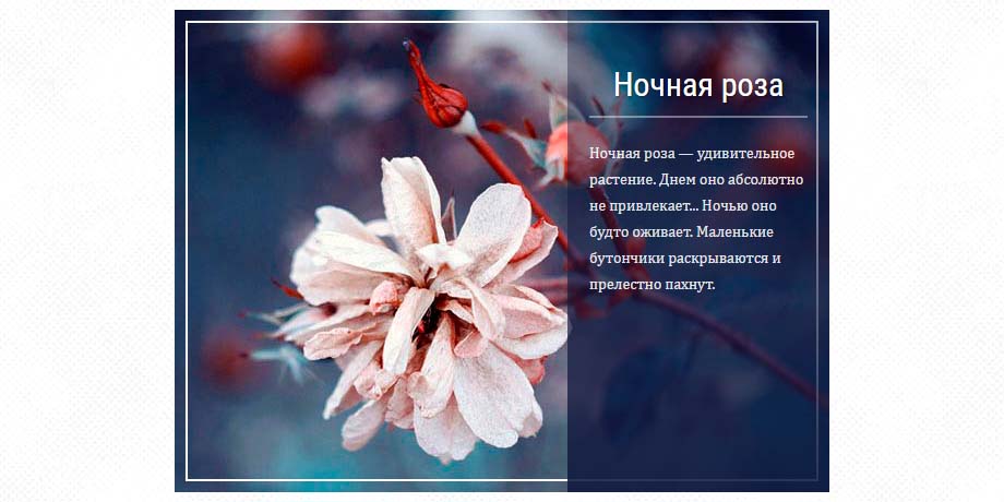
<h3 class="image-header">Ночная роза</h3>
<p>Ночная роза — удивительное растение...</p>
</div>
</div>* {
box-sizing: border-box;
}
.image-box {
position: relative;
width: 600px;
margin: 50px auto 0;
}
.image-box .border {
position: absolute;
top: 10px;
bottom: 10px;
left: 10px;
right: 10px;
border: 2px solid white;
z-index: 1;
}
.image-box img {
display: block;
position: relative;
width: 600px;
height: 442px;
}
.image-box .image-content {
position: absolute;
bottom: 0;
top: 0;
right: 0;
left: 60%;
padding: 20px;
z-index: 2;
background: linear-gradient(to bottom,rgba(18,26,63,0.3),rgba(18,26,63,0.9));
}
.image-box .image-header {
font-size: 30px;
padding-bottom: 10px;
border-bottom: 2px solid rgba(255,255,255,0.4);
color: white;
text-shadow: 1px 1px 2px rgba(0,0,0,0.4);
font-family: 'Roboto Condensed', sans-serif;
font-weight: normal;
}
.image-box p {
color: rgba(255,255,255,0.9);
font-size: 14px;
margin-top: 20px;
line-height: 24px;
}Идея 2. Изображение в круглой рамке
<div class="box">
  <div class="image-box">
    <img src="https://html5book.ru/wp-content/uploads/2015/10/flower-example-6.jpg">
  </div>
  <div class="details">
    <h3>Флокс</h3>
  <p>Флокс (лат. Phlox) — род красивоцветущих травянистых растений...</p>
  </div>
</div>
.box {
width: 400px;
margin: 50px auto 0;
text-align: center;
}
.image-box {
display: inline-block;
width: 150px;
height: 150px;
border-radius: 50%;
padding: 10px;
background: #EBE7DD;
}
img {
width: 100%;
height: 100%;
border-radius: 50%;
}
.details {
background: #EBE7DD;
margin-top: -70px;
padding: 70px 30px 30px;
border-radius: 5px;
}
.details h3 {
font-family: 'Ledger', serif;
text-transform: uppercase;
letter-spacing: 3px;
font-size: 24px;
color: #281F19;
}
.details p {
font-family: 'Ledger', serif;
color: #4C3D35;
line-height: 24px;
}Идея 3. Надпись к изображению в двойной рамке
<div class="post-wrap">
   <img src="https://html5book.ru/wp-content/uploads/2015/10/flower-example-4.jpg">
  <div class="post-inner">
    <span class="dot first"></span>
      <h3>Букет роз</h3>
    <span class="dot last"></span>
  </div>
    <p>Подари мне букет из роз...</p>
 </div>
*, *:before, *:after {
box-sizing: border-box;
}
.post-wrap {
background: white;
box-shadow: 0 1px 2px rgba(0,0,0,.2);
width: 420px;
margin: 50px auto 0;
padding: 10px;
text-align: center;
}
.post-inner {
margin: -75px 20px 20px;
padding: 15px;
background: #122330;
position: relative;
}
.post-inner:after {
display: block;
content: "";
position: absolute;
left: -10px;
right: -10px;
bottom: -10px;
top: -10px;
border: 3px solid #122330;
}
.dot {
height: 5px;
width: 5px;
background: #F15A40;
border-radius: 50%;
display: inline-block;
position: relative;
vertical-align: super;
}
.first {
margin-right: 24px;
}
.last {
margin-left: 24px;
}
.dot:before, .dot:after {
content: "";
height: 5px;
width: 5px;
background: #F15A40;
border-radius: 50%;
position: absolute;
top: 0;
}
.dot:before {
left: 10px;
}
.dot:after {
right: 10px;
}
.post-inner h3 {
font-family: 'Playfair Display', serif;
color: #EFECD9;
display: inline-block;
font-size: 24px;
line-height: 24px;
letter-spacing: 2px;
}
.post-wrap p {
font-family: 'Lora', serif;
padding-top: 20px;
line-height: 24px;
}Идея 4. Рамка-изображение для блока с картинкой
<div class="image-border">
  <img src="https://html5book.ru/wp-content/uploads/2015/10/flower-example-5.jpg">
  <div class="post-info">
  <h3 class="post-title">Ветка вишни</h3>
    <p><span class="meta">Май 11, 2015</span></p>
    <span class="diamond"></span>
    <span class="diamond"></span>
    <span class="diamond"></span>
  </div>
</div>
.image-border {
max-width: 300px;
margin: 50px auto 0;
padding: 15px;
border-width: 15px;
border-style: solid;
border-image: url(https://html5book.ru/wp-content/uploads/2015/10/border-diagonal.png) 25% repeat repeat;
background: white;
}
.post-info {
text-align: center;
}
.post-title {
font-family: 'Playfair Display', "Georgia","Times New Roman",serif;
font-size: 24px;
line-height: 1;
padding-bottom: 10px;
margin-bottom: 20px;
color: black;
}
.image-border img {
display: block;
max-width: 100%;
height: auto;
margin-bottom: 15px;
}
.meta {
display: inline-block;
font-size: 12px;
font-style: italic;
margin: 0 10px;
color: #999999;
}
.diamond {
width: 10px;
height: 10px;
border: 1px solid #000000;
display: inline-block;
margin: 0 5px;
transform: rotate(45deg);
position: relative;
}
.diamond:nth-of-type(2) {
background: black;
}Идея 5. Карточка товара со скидкой
<div class="post">
<div class="post-top">
<a href="#">
<img src="https://html5book.ru/wp-content/uploads/2015/10/flower-example-3.jpg" class="post-top-img">
</a>
<p class="post-top-angle">Скидка</p>
<p class="post-top-price"><span>500 ₽</span></p>
</div>
<div class="post-content">
<h3>Букет цветов</h3>
<p>В нашем магазине вы можете купить свежие цветы любого вида, от традиционных до экзотических.</p>
</div>
</div>* {
box-sizing: border-box;
}
p, h3 {margin: 0}
.post {
width: 300px;
margin: 50px auto 0;
position: relative;
background: white;
box-shadow: 0 2px 3px rgba(0,0,0,0.1);
border-radius: 3px;
font-family: 'Scada', sans-serif;
}
.post-top {
min-height: 45px;
position: relative;
overflow: hidden;
}
.post-top a {
text-decoration: none;
display: block;
}
.post-top-img {
border-radius: 3px 3px 0 0;
max-width: 100%;
height: auto;
vertical-align: middle;
}
.post-top-angle {
width: 180px;
height: 30px;
line-height: 30px;
position: absolute;
top: 20px;
right: -50px;
transform:rotate(45deg);
color: #fefefe;
text-align: center;
background: #F8CF82;
font-size: 16px;
font-weight:bold;
}
.post-top-price {
width: 100%;
position: absolute;
bottom: 0;
right: 0;
text-align: right;
}
.post-top-price span {
display: inline-block;
height: 45px;
line-height: 45px;
padding: 0 20px;
background: #F8CF82;
border-radius: 3px 0 0 0;
color: #fefefe;
font-size: 1.5em;
font-weight: bold;
}
.post-top-price:after {
content: " ";
display: block;
height: 5px;
width: 100%;
position: absolute;
bottom: 0;
left: 0;
background: #F8CF82;
}
.post-content {
padding: 20px;
font-family: 'Scada', sans-serif;
}
.post-content h3 {
font-size: 1.5em;
}
.post-content p {
margin-top: 10px;
color: #6e6e6e;
line-height: 1.5em;
}Идея 6. Появляющаяся надпись на затемненном фоне и эффект приближения изображения при наведении
<div class="box">
  <div class="box-inner">
    <a href="#">
      <img src="https://html5book.ru/wp-content/uploads/2015/10/flower-example-1.jpg">
    </a>
    <div class="text">
      <h2>Орхидеи</h2>
    </div>
  </div>
</div>
.box {
width: 400px;
margin: 50px auto 0;
position: relative;
overflow: hidden;
}
.box:before {
content: "";
position: absolute;
top: 0;
right: 0;
bottom: 0;
left: 0;
background: rgba(0,0,0,0.3);
z-index: 1;
opacity: 0;
transition: all 0.4s ease-in-out;
}
.box-inner img {
transition: all 0.4s ease-in-out;
}
.text {
position: absolute;
left: 0;
right: 0;
top: 50%;
margin-top: -40px;
text-align: center;
z-index: 2;
}
.text h2 {
font-family: 'Forum', cursive;
color: white;
display: inline-block;
font-size: 50px;
line-height: 75px;
font-weight: 400;
text-transform: uppercase;
border-width: 1px 0;
border-color: rgba(255,255,255,0.5);
border-style: solid;
opacity: 0;
transition: all 0.4s ease-in-out;
}
.box:hover:before {
opacity: 1;
}
.box:hover img {
transform: scale(1.1);
}
.box:hover .text h2 {
opacity: 1;
}Идея 7. Оформление анонса статьи
<div class="card">
  <h3 class="card-title">Весна</h3>
    <div>
      <img src="https://html5book.ru/wp-content/uploads/2015/10/flower-example-7.jpg">
    </div>
    <p>Придет весна и вновь заглянет...</p>
</div>
.card {
padding: 20px;
border: 1px solid #eaeaea;
max-width: 300px;
width: 100%;
margin: 50px auto 0;
background: white;
}
.card-title {
font-family: 'Playfair Display', "Georgia","Times New Roman",serif;
font-size: 20px;
line-height: 1;
padding-bottom: 15px;
margin: 10px 0 20px;
color: black;
text-align: center;
border-bottom: 3px double #eaeaea;
}
.card img {
display: block;
max-width: 100%;
height: auto;
margin-bottom: 20px;
}
.card p {
font-family: 'Roboto', sans-serif;
font-size: 14px;
line-height: 22px;
margin-bottom: 0;
}Идея 8. Картинка на подложке
<div class="image">
   <img src="https://html5book.ru/wp-content/uploads/2015/10/flower-example-8.jpg">
</div>
.image {
width: 300px;
margin: 50px auto 0;
position: relative;
border: 6px solid white;
border-radius: 3px;
box-shadow: 2px 2px 5px rgba(0,0,0,0.3);
}
.image img {
max-width: 100%;
display: block;
}
.image:before, .image:after {
content: "";
width: 300px;
height: 281px;
position: absolute;
z-index: -1;
border: 6px solid white;
border-radius: 3px;
box-shadow: 2px 2px 5px rgba(0,0,0,0.3);
}
.image:before {
background: #F5CEC6;
top: 0px;
left: -10px;
transform: rotate(-5deg);
}
.image:after {
background: #DCB8B2;
top: 5px;
left: 0px;
transform: rotate(4deg);
}Идея 9. Трансформирующаяся надпись к изображению при наведении
<article class="slide">
  <img src="https://html5book.ru/wp-content/uploads/2015/10/flower-example-9.jpg">
  <div class="slide-content">
    <div class="slide-item">
	<h3>Полевые цветы</h3>
        <p>Полевые цветы на зелёном лугу...</p>
    </div>
  </div>
</article>
*, *:after, *:before {
box-sizing: border-box;
padding: 0;
margin: 0;
}
.slide {
display: block;
width: 400px;
margin: 50px auto 0;
position: relative;
}
.slide img {
display: block;
position: relative;
max-width: 100%;
height: auto;
}
.slide-content {
margin: -10px 20px 0;
position: relative;
z-index: 3;
text-align: center;
transform: translateY(0);
transition: transform .4s ease-in-out;
}
.slide-content:before, .slide-content:after {
content: "";
position: absolute;
bottom: 0;
margin: 0 0 2px;
height: 1px;
box-shadow: 0 0 7px 0 rgba(0,0,0,0.6);
transition: .4s ease-in-out;
}
.slide-content:before {
left: 0;
right: 50%;
transform: rotate(1deg);
}
.slide-content:after {
right: 0;
left: 50%;
transform: rotate(-1deg);
}
.slide-item {
background: #FBFAF1;
padding: 20px 20px 18px;
position: relative;
z-index: 5;
border-radius: 0;
transition: .4s ease-in-out;
}
.slide-item h3 {
font-family: 'Playfair Display', serif;
color: #B4111A;
font-size: 28px;
margin-bottom: 15px;
}
.slide-item p {
font-family: 'Open Sans', sans-serif;
font-size: 14px;
line-height: 1.5em;
color: #1E2630;
}
.slide:hover .slide-content{
transform:translateY(-10%);
}
.slide:hover .slide-item{
border-radius: 0 0 200px 200px/0 0 10px 10px;
}
.slide:hover .slide-content:before {
left: 10px;
}
.slide:hover .slide-content:after {
right: 10px;
}
.slide:hover .slide-content:before, .slide:hover .slide-content:after {
box-shadow: 0 0 16px 3px rgba(0,0,0,0.6);
margin: 0 0 6px;
}
.slide:hover .slide-content:before {
right: 50.4%;
}
.slide:hover .slide-content:after {
left: 50.4%;
}Идея 10. Появляющаяся рамка при наведении
<article>
  <div class="post">
    <a href="#">
      <img src="https://html5book.ru/wp-content/uploads/2015/10/flower-example-10.jpg">
    </a>
  </div>
</article>
article {
display: block;
}
.post {
position: relative;
width: 400px;
margin: 50px auto 0;
}
.post:before, .post a:before,.post a:after {
content: "";
opacity: 0;
position: absolute;
transition: opacity .5s ease-in-out, transform .5s ease-in-out;
}
.post:before {
background: rgba(255, 255, 255, .2);
left: 0;
right: 0;
width: 100%;
height: 100%;
}
.post:hover:before {
opacity: 1;
}
.post:hover a:before, .post:hover a:after {
opacity: 1;
transform: scale(1);
}
.post a:before {
border-bottom: 1px solid white;
border-top: 1px solid white;
bottom: 30px;
left: 10px;
right: 10px;
top: 30px;
transform: scale(0, 1);
transform-origin: 0 0;
}
.post a:after {
border-left: 1px solid white;
border-right: 1px solid white;
bottom: 10px;
left: 30px;
right: 30px;
top: 10px;
transform: scale(1, 0);
transform-origin: 100% 0 ;
}