Вертикальное меню для сайта
Вертикальное меню делается на основе списка, маркированного или нумерованного. По умолчанию все элементы списка <li>...</li> располагаются вертикально, занимая по ширине всю ширину элемента контейнера <ul>...</ul>, который в свою очередь занимает всю ширину его блока-контейнера.
Элементы списка <li>...</li> могут содержать не только ссылки, но также заголовки, иконки, картинки. С помощью вертикального меню можно оформлять комментарии на сайте, список категорий и т.д.
Перейти на страницу с примерами
- Содержание:
- 1. Вертикальное меню с заголовком
- 2. Вертикальное меню в стиле «схема метро»
- 3. Вертикальное меню с эффектами при наведении
- 4. Вертикальное меню с иконками
- 5. Вертикальное меню с картинками
1. Вертикальное меню с заголовком
Простой элегантный вариант оформления. Подходит для стилизации категорий на сайте. При наведении элемент списка меняет цвет ссылки.
<div class="widget">
  <h3 class="widget-title">Категории</h3>
  <ul class="widget-list">
    <li><a href="">Дизайн</a></li>
    <li><a href="">Фотошоп</a></li>
    <li><a href="">Типографика</a></li>
    <li><a href="">Музыка</a></li>
    <li><a href="">Видео</a></li>
  </ul>
</div>
* {box-sizing: border-box; margin: 0;}
.widget {
padding: 20px 30px;
background: white;
font-family: 'Roboto', sans-serif;
}
.widget-title {
text-transform: uppercase;
letter-spacing: 2px;
color: #222;
font-size: 16px;
padding-left: 15px;
margin-bottom: 15px;
border-left: 2px solid #b99d61;
}
.widget-list {
padding: 0;
list-style: none;
}
.widget-list a:before {
content: "\2014";
margin-right: 14px;
}
.widget-list a {
text-decoration: none;
outline: none;
display: block;
padding: 6px 0;
letter-spacing: 1px;
font-weight: 300;
color: #444;
transition: .3s linear;
}
.widget-list a:hover {color: #b99d61;}2. Вертикальное меню в стиле «схема метро»
Интересное решение для оформления вертикального меню, предусмотрено добавление вложенных меню. «Ветка метро» — левая граница списка, маркеры генерируются перед каждой ссылкой.
<ul class="metro">
    <li><a href="">Элемент списка</a>
      <ul>
        <li><a href="">Элемент вложенного списка</a></li>
        <li><a href="">Элемент вложенного списка</a></li>
        <li><a href="">Элемент вложенного списка</a></li>
      </ul>
    </li>
    <li><a href="">Элемент списка</a></li>
    <li><a href="">Элемент списка</a></li>
</ul>
.metro {
list-style: none;
padding: 0;
margin: 30px 0 0 50px;
border-left: 5px solid #DAE4F1;
}
.metro li {line-height: 2em;}
.metro ul {
margin: 20px 0 20px 15px;
padding: 0;
border: none;
list-style: none;
}
.metro ul:before, .metro ul:after {
content: "";
width: 5px;
height: 28px;
background: #DAE4F1;
position: relative;
display: block;
left: -9px;
}
.metro ul:before {
transform: rotate(-45deg);
margin-top: -15px;
}
.metro ul:after {
transform: rotate(45deg);
bottom: -20px;
}
.metro ul li {border-left: 5px solid #DAE4F1;}
.metro ul li:first-child {
margin-top: -5px;
padding-top: 5px;
}
.metro ul li:last-child {
padding-bottom: 9px;
margin-bottom: -25px;
}
.metro a {
text-decoration: none;
display: block;
font-family: 'Noto Sans', sans-serif;
color: #4A4B4D;
}
.metro a:before {
content: "";
display: inline-block;
background: #CA682D;
width: 12px;
height: 12px;
left: -9px;
position: relative;
border-radius: 50%;
margin-right: .5em;
}3. Вертикальное меню с эффектами при наведении
Иконка и фоновая заливка, проявляющиеся при наведении на элемент списка, помогут разнообразить дизайн элементов вертикального меню.
<div class="category-wrap">
  <h3>Категории</h3>
  <ul>
    <li><a href="">Дизайн</a></li>
    <li><a href="">Фотошоп</a></li>
    <li><a href="">Книги</a></li>
    <li><a href="">Журналы</a></li>
    <li><a href="">Картинки</a></li>
  </ul>
</div>
.category-wrap {
padding: 15px;
background: white;
width: 200px;
box-shadow: 2px 2px 8px rgba(0,0,0,.1);
font-family: "Helvetica Neue", Helvetica, Arial, sans-serif;
}
.category-wrap h3 {
font-size: 16px;
color: rgba(0,0,0,.6);
margin: 0 0 10px;
padding: 0 5px;
position: relative;
}
.category-wrap h3:after {
content: "";
width: 6px;
height: 6px;
background: #80C8A0;
position: absolute;
right: 5px;
bottom: 2px;
box-shadow: -8px -8px #80C8A0, 0 -8px #80C8A0, -8px 0 #80C8A0;
}
.category-wrap ul {
list-style: none;
margin: 0;
padding: 0;
border-top: 1px solid rgba(0,0,0,.3);
}
.category-wrap li {margin: 12px 0 0 0px;}
.category-wrap a {
text-decoration: none;
display: block;
font-size: 13px;
color: rgba(0,0,0,.6);
padding: 5px;
position: relative;
transition: .3s linear;
}
.category-wrap a:after {
content:"\f18e";
font-family: FontAwesome;
position: absolute;
right: 5px;
color: white;
transition: .2s linear;
}
.category-wrap a:hover {
background: #80C8A0;
color: white;
}4. Вертикальное меню с иконками
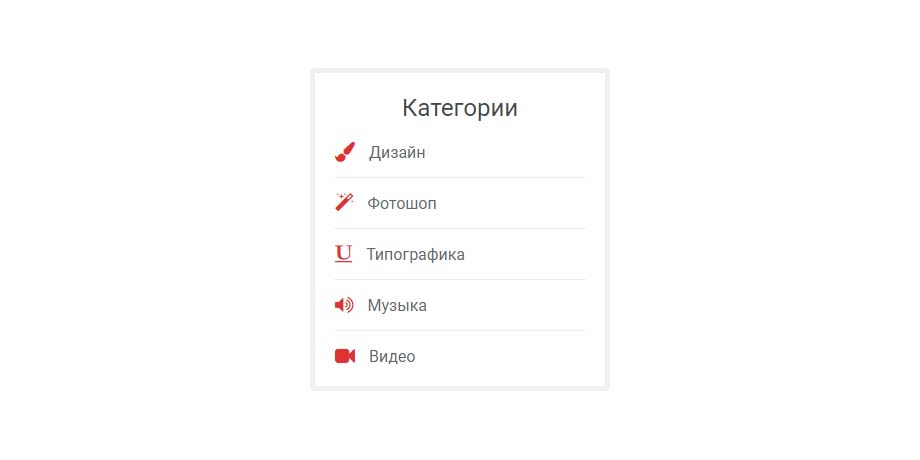
Иконки в меню создают визуальный якорь, дополняя словесное описание каждой категории. Для отображения иконок нужно подключить шрифт Awesome. Вы также можете использовать любой другой иконочный шрифт или иконки-картинки.
<div class="widget">
  <h3>Категории</h3>
  <ul>
    <li><a href="">Дизайн</a></li>
    <li><a href="">Фотошоп</a></li>
    <li><a href="">Типографика</a></li>
    <li><a href="">Музыка</a></li>
    <li><a href="">Видео</a></li>
  </ul>
</div>
* {box-sizing: border-box; margin: 0;}
.widget {
padding: 20px;
border: 5px solid #f1f1f1;
background: #fff;
border-radius: 5px;
font-family: 'Roboto', sans-serif;
}
.widget h3 {
margin-bottom: 20px;
text-align: center;
font-size: 24px;
font-weight: normal;
color: #424949;
}
.widget ul {
margin: 0;
padding: 0;
list-style: none;
width: 250px;
}
.widget li {
border-bottom: 1px solid #eaeaea;
padding-bottom: 15px;
margin-bottom: 15px;
}
.widget li:last-child {
border-bottom: none;
margin-bottom: 0;
padding-bottom: 0;
}
.widget a {
text-decoration: none;
color: #616a6b;
display: inline-block;
}
.widget li:before {
font-family: FontAwesome;
font-size: 20px;
vertical-align:bottom;
color: #dd3333;
margin-right: 14px;
}
.widget li:nth-child(1):before {content:"\f1fc";}
.widget li:nth-child(2):before {content:"\f0d0";}
.widget li:nth-child(3):before {content:"\f0cd";}
.widget li:nth-child(4):before {content:"\f028";}
.widget li:nth-child(5):before {content:"\f03d";}5. Вертикальное меню с картинками
Данный пример можно использовать для оформления блоков с новинками, похожими товарами, и т.п. сайте интернет-магазина.
<div class="col">
<h3 class="widget-title">Распродажа</h3>
<div class="price-line">
<div class="product-image">
<a href=""><img src="https://html5book.ru/wp-content/uploads/2017/03/sport1.jpeg"></a>
</div>
<div class="product-content">
<div class="product-title"><a href="">Продукт 1</a></div>
<div class="star-rating"> </div>
<div class="price-box"><span>₽ 2000</span></div>
</div>
</div>
<div class="price-line">
<div class="product-image">
<a href=""><img src="https://html5book.ru/wp-content/uploads/2017/03/sport2.jpeg"></a>
</div>
<div class="product-content">
<div class="product-title"><a href="">Продукт 2</a></div>
<div class="star-rating"> </div>
<div class="price-box"><span>₽ 2500</span></div>
</div>
</div>
<div class="price-line">
<div class="product-image">
<a href=""><img src="https://html5book.ru/wp-content/uploads/2017/03/sport3.jpeg"></a>
</div>
<div class="product-content">
<div class="product-title"><a href="">Продукт 3</a></div>
<div class="star-rating"> </div>
<div class="price-box"><span>₽ 2070</span></div>
</div>
</div>
</div>@import url('https://fonts.googleapis.com/css?family=Open+Sans:300,400,600');
.col {
width: 300px;
background: white;
padding: 20px;
border: 1px solid #eeeeee;
font-family: 'Open Sans', sans-serif;
}
.col * {margin: 0;}
.widget-title {
margin: 0 0 30px;
line-height: 1;
text-transform: uppercase;
letter-spacing: 1px;
font-size: 20px;
color: #242424;
overflow: hidden;
}
.widget-title:after {
content: "";
position: relative;
display: inline-block;
width: 100%;
vertical-align: middle;
right: -15px;
margin-right: -100%;
border-top: 2px solid #cca86d;
}
.price-line {margin-bottom: 20px;}
.price-line:last-child {margin-bottom: 0;}
.price-line:after {
content: "";
display: table;
clear: both;
}
.product-image {
width: 80px;
float: left;
}
.product-image a {
display: block;
outline: none;
}
.product-image img {
display: block;
width: 100%;
}
.product-content {
float: left;
margin-left: 20px;
}
.product-title {
font-size: 18px;
margin-bottom: 10px;
line-height: 1;
}
.product-title a {
text-decoration: none;
color: #242424;
}
.price-box {
color: #666;
font-size: 18px;
line-height: 1;
}
.star-rating {
margin-bottom: 10px;
font-size: 13px;
position: relative;
font-family: 'FontAwesome';
}
.star-rating:before {
content: "\f005 \f005 \f005 \f005 \f005";
position: absolute;
top: 0;
left: 0;
color: #FF9919;
}