Нестандартные блоки на сайте
Очередная порция вдохновляющих возможностей CSS3 — примеры разметки и стилей для нестандартных блоков на сайте. HTML-элементы по умолчанию формируют на веб-странице прямоугольные блоки, поэтому для создания нестандартных очертаний чаще всего используются готовые изображения. Тем не менее, большинство подобных блоков можно реализовать с помощью CSS-стилей, используя следующие приёмы:
- CSS3-трансформации;
- Скругление углов с помощью свойства border-radius;
- Создание копий элемента при помощи CSS3-тени;
- Генерация блоков с помощью свойства content.
Перейти на страницу с примерами
Пример 1. Новогодняя этикетка
Нестандартный блок — в данном случае ромб, создаётся за счёт уменьшения размеров блока по высоте и ширине и его поворота.

<div class="tag-inner">
<h3>Merry<br>Christmas</h3>
<p><img src="https://html5book.ru/wp-content/uploads/2017/05/bells.png"></p>
<div class="tag-line"></div>
</div>
* {
box-sizing: border-box;
}
.tag-inner {
position: relative;
width: 240px;
margin: 100px auto 0;
padding: 30px 0 0;
background: #C0D9C4;
}
.tag-inner:before {
content: "";
position: absolute;
z-index: -1;
top: -120px;
width: 240px;
height: 240px;
background: #C0D9C4;
transform: scale(0.76, 0.4) rotate(45deg);
border-bottom-left-radius: 30px;
border-top-left-radius: 10px;
border-top-right-radius: 30px;
}
.tag-inner:after {
content: "";
position: absolute;
z-index: 10;
top: -40px;
left: calc(50% - 10px);
width: 20px;
height: 20px;
border-radius: 50%;
background: #ffffff;
box-shadow: inset 1px 1px 3px rgba(0, 0, 0, .3), 0 0 0 7px rgba(0, 0, 0, .08);
}
.tag-inner h3 {
margin: 0;
font-family: 'Great Vibes', cursive;
font-size: 36px;
text-align: center;
letter-spacing: 3px;
color: #BA4732;
text-shadow: 3px -2px 0 white;
}
.tag-inner p {
position: relative;
margin: 0;
padding: 20px;
text-align: center;
}
.tag-inner p:after {
content: "";
position: absolute;
width: 100%;
height: 10px;
left: 0;
bottom: -10px;
background: radial-gradient(#C0D9C4 0%, #C0D9C4 70%, rgba(255, 255, 255, 0) 70%, rgba(255, 255, 255, 0) 100%) 0 -10px;
background-size: 20px 20px;
background-repeat: repeat-x;
}
.tag-line {
height: 60px;
background: repeating-linear-gradient(90deg, #F4EDD6, #F4EDD6 19px, #f4dc9c 19px, #f4dc9c 20px);
}Пример 2. Купон-этикетка
Блок-трапеция образован двумя позиционированными блокам-ромбами.
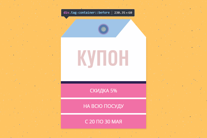
<div class="tag-container">
<div class="tag-inner">
<h1>Купон</h1>
<ul>
<li>Скидка 5%</li>
<li>На всю посуду</li>
<li>С 20 по 30 мая</li>
</ul>
</div>
</div>
* {
box-sizing: border-box;
}
.tag-container {
position: relative;
width: 280px;
margin: 110px auto 0;
box-shadow: 1px 2px 5px rgba(0, 0, 0, .1)
}
.tag-container:before, .tag-container:after {
content: "";
position: absolute;
top: -60px;
right: 50px;
left: 50px;
background: #FEFEFF;
height: 60px;
transform: skew(-40deg);
transform-origin: 0 0;
}
.tag-container:after {
transform: skew(40deg);
}
.tag-inner {
position: relative;
padding-top: 20px;
background: #FEFEFF;
}
.tag-inner:before {
content: "";
position: absolute;
z-index: 5;
top: -35px;
left: calc(50% - 8px);
width: 16px;
height: 16px;
border-radius: 50%;
background: #FEC461;
box-shadow: inset 2px 2px 4px rgba(0, 0, 0, .3), 0 0 0 7px #2a2050, 0 0 0 10px #F170A6;
}
.tag-inner h1 {
margin: 0;
padding-bottom: 35px;
font-family: 'Oswald', sans-serif;
font-size: 60px;
text-align: center;
letter-spacing: 3px;
text-transform: uppercase;
color: #E6C6C7;
border-bottom: 8px solid #2a2050
}
.tag-inner ul {
margin: 0;
padding: 0;
list-style: none;
text-align: center;
}
.tag-inner li {
padding: 12px 20px;
background: #F170A6;
border-bottom: 5px solid #FEFEFF;
font-family: 'Open Sans', sans-serif;
color: #FEFEFF;
text-transform: uppercase;
}
.tag-inner li:last-child {
border-bottom: none;
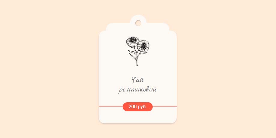
}Пример 3. Этикетка с закруглёнными углами
<div class="tag-container">
<div class="tag-inner">
<img src="https://html5book.ru/wp-content/uploads/2017/05/form-flower.png">
<h3>Чай<br>ромашковый</h3>
<div class="price-container">
<a class="price-button" href="">200 руб.</a>
</div>
</div>
</div>
* {
box-sizing: border-box;
}
body {
background: #FFEBD8;
}
.tag-container {
position: relative;
margin: 55px auto 0;
width: 260px;
text-align: center;
font-family: Roboto;
}
.tag-container:before {
content: "";
position: absolute;
top: -25px;
left: 25px;
right: 25px;
height: 25px;
background: #FCF8F3;
border-top-left-radius: 20px;
border-top-right-radius: 20px;
}
.tag-container:after {
content: "";
position: absolute;
z-index: 5;
top: -35px;
left: calc(50% - 8px);
width: 20px;
height: 20px;
border-radius: 50%;
background: #FFEBD8;
box-shadow: inset 1px 1px 3px rgba(0, 0, 0, .3), 0 0 0 18px #FCF8F3;
}
.tag-inner {
padding: 20px 20px 40px;
border-radius: 20px;
background: #FCF8F3;
box-shadow: 0 3px 4px rgba(0, 0, 0, .1)
}
.tag-inner h3 {
font-family: 'Marck Script', cursive;
font-size: 26px;
color: #777;
font-weight: normal;
}
.price-container {
position: relative;
margin: 0 -20px;
}
.price-container:after {
content: "";
position: absolute;
left: 0;
right: 0;
top: 12px;
height: 2px;
background: #FE5741;
}
.price-button {
position: relative;
z-index: 5;
display: inline-block;
line-height: 30px;
text-decoration: none;
color: white;
padding: 0 20px;
background: #FE5741;
border-radius: 20px;
}Пример 4. Ретро-значок
<div class="badge-border">
<div class="badge-content">
<h2>100%</h2>
<h3>Хлопок</h3>
</div>
</div>
* {
box-sizing: border-box;
}
.badge-border {
position: relative;
width: 150px;
height: 150px;
margin: 25px auto;
background: #D96B52;
border-radius: 12px;
text-align: center;
font-family: 'Lobster', cursive;
}
.badge-border:before, .badge-border:after {
content: "";
position: absolute;
z-index: -1;
top: 0;
left: 0;
width: 150px;
height: 150px;
background: #D96B52;
border-radius: 12px;
}
.badge-border:before {
transform: rotate(30deg);
}
.badge-border:after {
transform: rotate(60deg);
}
.badge-content {
position: absolute;
top: 50%;
left: 50%;
width: 160px;
height: 160px;
margin-left: -80px;
margin-top: -80px;
background: #F3BD5B;
border: 5px solid #FFF3D8;
border-radius: 50%;
text-align: center;
}
.badge-content h2 {
position: absolute;
top: 5px;
left: 5px;
width: 140px;
margin: 0;
height: 50%;
line-height: 100px;
background: #FFF3D8;
border-radius: 140px 140px 0 0;
font-size: 40px;
color: #A66844;
}
.badge-content h3 {
position: absolute;
bottom: 5px;
left: 5px;
width: 140px;
margin: 0;
line-height: 75px;
color: #FFF3D8;
text-transform: uppercase;
font-weight: normal;
font-size: 24px;
}Пример 5. Диагональный блок
<section>
<h3>Диагональный фон</h3>
</section>
* {
box-sizing: border-box;
}
body {
background: #FFEFD7;
}
section {
position: relative;
margin-top: 200px;
padding: 100px 0;
overflow: hidden;
background: #F1B6A8;
text-align: center;
}
section:before, section:after {
content: "";
position: absolute;
left: 0;
border-width: 0 0 50px 100vw;
border-style: solid;
}
section:before {
top: 0;
border-color: #FFEFD7 #FFEFD7 #F1B6A8 #FFEFD7;
}
section:after {
bottom: 0;
border-color: #F1B6A8 #F1B6A8 #FFEFD7 #F1B6A8;
}
section h3 {
margin: 0;
color: #FFEFD7;
font-family: 'Playfair Display', serif;
font-weight: normal;
font-size: 40px;
background: #F1B6A8;
}Пример 6. Этикетка
<div class="wrap">
<div class="inner">
<div class="text-wrap">
<h3>Bon Bon's</h3>
<h4>Candy house</h4>
<table>
<tr><th colspan="3">English Toffe</th></tr>
<tr><td></td><td></td><td></td></tr>
</table>
</div>
</div>
</div>
* {
margin: 0;
box-sizing: border-box;
}
.wrap {
width: 300px;
margin: 50px auto 0;
padding: 150px 20px;
background: radial-gradient(#f16462 2px, #faf2cc 3px);
background-size: 25px 25px;
border-radius: 5px;
}
.inner {
position: relative;
padding: 20px 30px;
background: #fbfcfd;
text-align: center;
}
.inner:before {
content: "";
position: absolute;
left: 0;
right: 0;
top: -35px;
bottom: -35px;
border-radius: 50%;
background: inherit;
}
.text-wrap {
position: relative;
}
.text-wrap h3 {
font-family: 'Rouge Script', cursive;
font-size: 50px;
font-weight: normal;
line-height: 1;
}
.text-wrap h4 {
font-family: 'Roboto Condensed', sans-serif;
text-transform: uppercase;
}
.text-wrap table {
width: 100%;
table-layout: fixed;
margin: 30px 0 10px;
border-collapse: collapse;
border-top: 2px solid #a0a0a0;
border-bottom: 2px solid #a0a0a0;
font-family: 'Roboto Condensed', sans-serif;
}
.text-wrap table th {
height: 40px;
}
.text-wrap table td {
height: 40px;
border-top: 2px solid #a0a0a0;
border-right: 2px solid #a0a0a0;
}
.text-wrap table td:last-child {
border-right: none;
}