Красивое оформление изображений на сайте
Картинки и фотографии являются важными элементами веб-страниц. Они не только разбавляют текст и привлекают больше внимания к страницам сайта, но также дают возможность заменить часть текста, делая информацию более доступной и запоминающейся.
Хотя красивые изображения сами по себе являются украшением сайта, их можно сделать ещё привлекательнее, создав с помощью css-стилей уникальные рамки для картинок галереи или одиночных фотографий.
Перейти на страницу с примерами
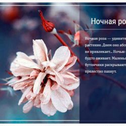
Пример 1. Красивая угловая рамка для изображений
<div class="image-wrapper">
<div class="image-inner">
<img src="https://html5book.ru/wp-content/uploads/2017/08/pastel-rose.jpg">
</div>
</div>
* {
box-sizing: border-box;
}
.image-wrapper {
position: relative;
max-width: 400px;
margin: 50px auto;
padding: 15px;
background: #DAEBE8;
}
.image-inner {
position: relative;
}
.image-wrapper img {
display: block;
width: 100%;
}
.image-wrapper:before, .image-wrapper:after, .image-inner:before, .image-inner:after {
content: "";
position: absolute;
width: 50px;
height: 50px;
}
.image-wrapper:before {
bottom: 0;
left: 0;
border-left: 6px double #384D26;
border-bottom: 6px double #384D26;
}
.image-wrapper:after {
right: 0;
top: 0;
border-right: 6px double #384D26;
border-top: 6px double #384D26;
}
.image-inner:before {
bottom: -15px;
right: -15px;
border-right: 6px double #384D26;
border-bottom: 6px double #384D26;
}
.image-inner:after {
top: -15px;
left: -15px;
border-left: 6px double #384D26;
border-top: 6px double #384D26;
}Пример 2. Перспективная рамка для фотографии
<div class="transform-border">
<img src="https://html5book.ru/wp-content/uploads/2016/12/romantika.jpg">
</div>
* {
box-sizing: border-box;
}
.transform-border {
position: relative;
max-width: 400px;
margin: 50px auto;
transform: perspective(3000px) rotateY(29deg);
}
.transform-border img {
display: block;
width: 100%;
box-shadow: -12px 11px 1px #f2f2f2;
}
.transform-border:after {
content: "";
position: absolute;
width: 100%;
height: 100%;
left: -22px;
top: 22px;
background: #cccccc;
z-index: -1;
}Пример 3. Двойная смещённая рамка для фотографии
<div class="dbl-border">
<div class="image-wrapper">
<img src="https://html5book.ru/wp-content/uploads/2017/01/white-lady.jpg">
</div>
</div>
* {
box-sizing: border-box;
}
.dbl-border {
position: relative;
display: table;
margin: 50px auto;
}
.dbl-border img {
display: block;
}
.dbl-border:before, .dbl-border:after {
content: "";
position: absolute;
z-index: 1;
width: 100%;
height: 100%;
border: 2px solid #40D8EC;
}
.dbl-border:before {
top: -15px;
left: -15px;
}
.dbl-border:after {
right: -15px;
bottom: -15px;
}
.image-wrapper {
position: relative;
z-index: 2;
padding: 5px;
background: white;
box-shadow: 1px 1px 20px 0 rgba(0, 0, 0, 0.1);
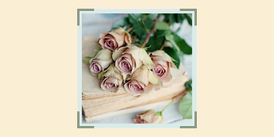
}Пример 4. Рамка с уголками
<div class="image-decor">
<img src="https://html5book.ru/wp-content/uploads/2015/10/flower-example-9.jpg">
</div>
* {
box-sizing: border-box;
}
.image-decor {
position: relative;
display: table;
margin: 50px auto;
border: 5px solid #fff;
box-shadow: 1px 1px 20px 0 rgba(0, 0, 0, .1);
}
.image-decor:before, .image-decor:after {
content: "";
position: absolute;
z-index: 2;
width: 150px;
height: 55px;
background: #fff;
box-shadow: 0 -10px 10px -5px rgba(0, 0, 0, .1);
}
.image-decor:before {
left: -50px;
bottom: -30px;
transform: rotate(30deg);
}
.image-decor:after {
right: -50px;
bottom: -30px;
transform: rotate(-30deg);
}
.image-decor img {
display: block;
}Пример 5. Двойная пересекающаяся рамка для картинки
<div class="border-gorizontal">
<div class="border-vertical">
<img src="https://html5book.ru/wp-content/uploads/2017/04/blurred-cherry.jpg">
</div>
</div>
* {
box-sizing: border-box;
}
.border-gorizontal {
position: relative;
max-width: 600px;
margin: 50px auto;
box-shadow: 0px 2px 10px rgba(0, 0, 0, 0.48);
}
.border-gorizontal img {
display: block;
width: 100%;
}
.border-gorizontal:before {
content: "";
position: absolute;
right: -20px;
left: -20px;
bottom: 14px;
z-index: 1;
border-top: 6px double #FE543E;
}
.border-gorizontal:after {
content: "";
position: absolute;
top: 14px;
left: -20px;
right: -20px;
z-index: 2;
border-top: 6px double #FE543E;
}
.border-vertical {
position: relative;
}
.border-vertical:before {
content: "";
position: absolute;
left: 14px;
top: -20px;
bottom: -20px;
z-index: 3;
border-left: 6px double #FE543E;
}
.border-vertical:after {
content: "";
position: absolute;
right: 14px;
top: -20px;
bottom: -20px;
z-index: 4;
border-left: 6px double #FE543E;
}